Food Co-ops hold a place near and dear to my heart. I’ve shopped, volunteered, and worked at them. I love the co-op smell. Produce, tea, spices, and anything and everything from the bulk section mixing together to create that distinct, heady aroma. Co-ops are a community experience. Connections are made and local businesses are supported. I can’t say enough good things about them!
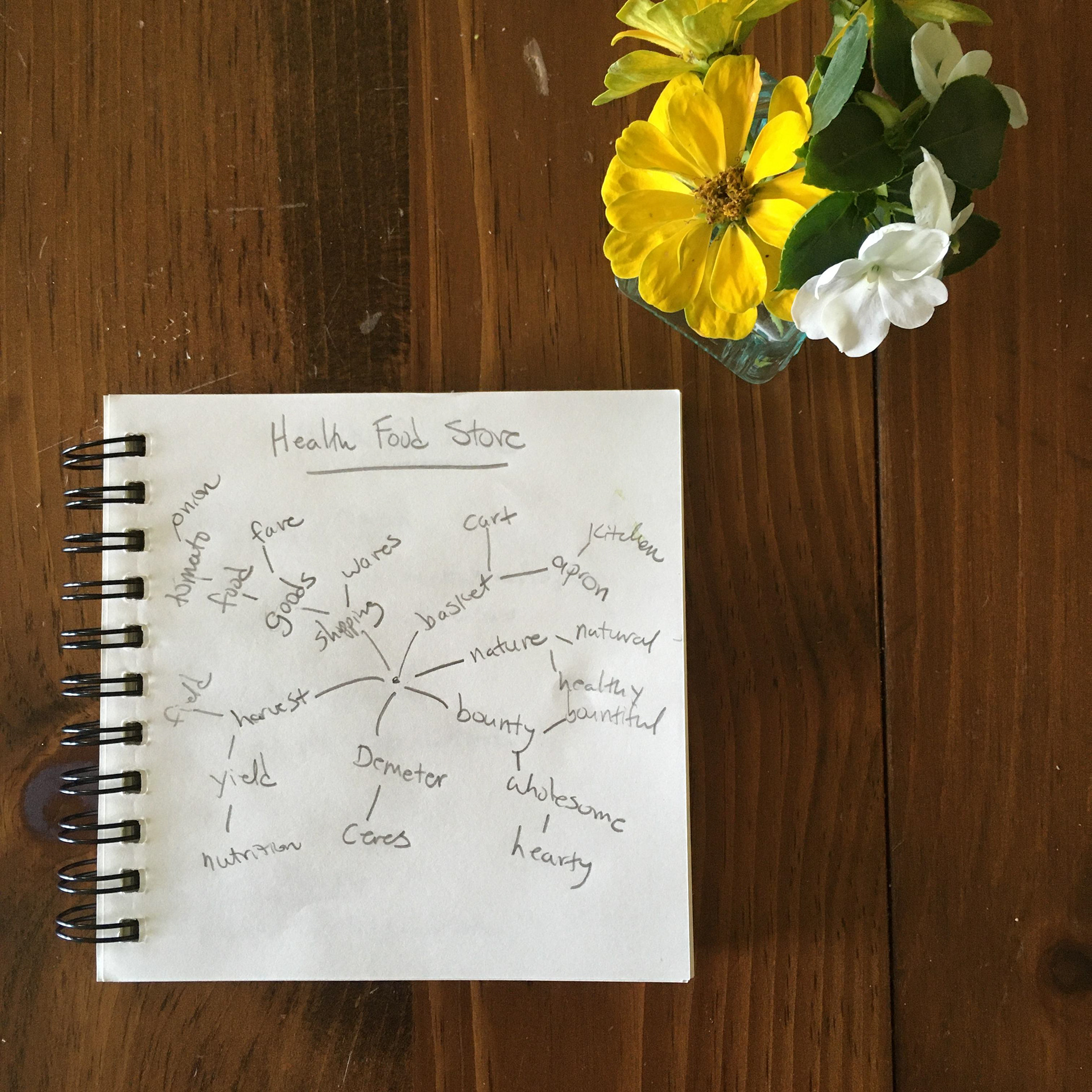
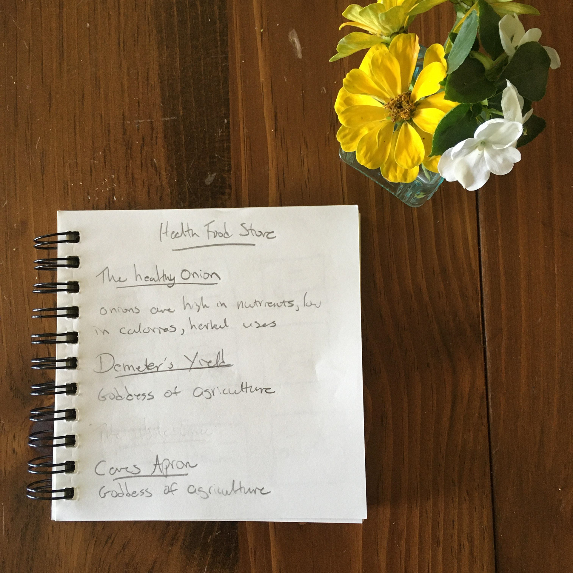
This brand identity for The Healthy Onion Food Coop started out with some mind-mapping. What’s a fun and original name for a food co-op? I had three contenders – “The Healthy Onion”, “Demeter’s Yield”, and “Ceres’ Apron”. The Healthy Onion won out. Onions are high in nutrients and are used in both cooking and herbalism, something that would speak to the health conscious co-op demographic.
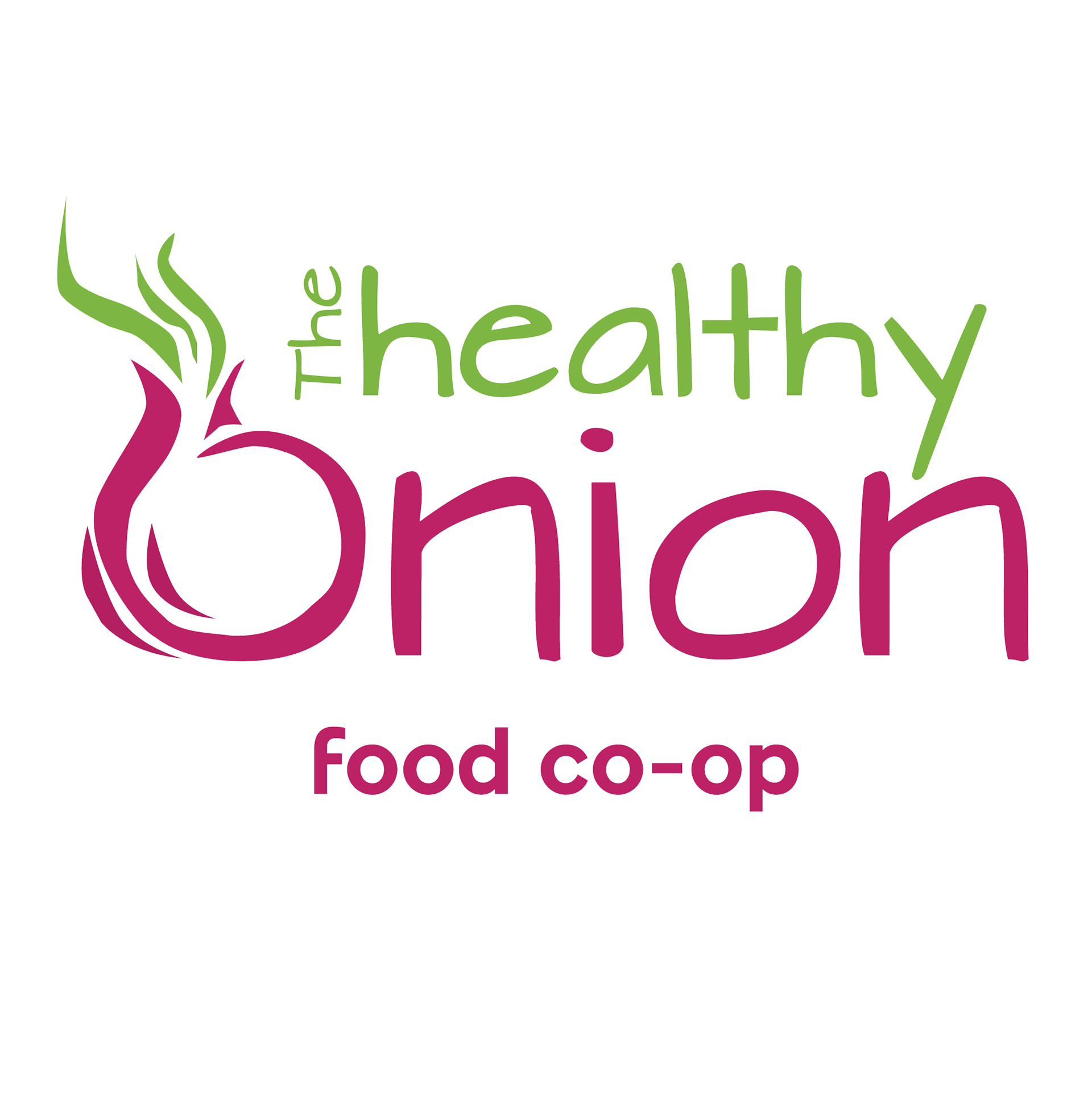
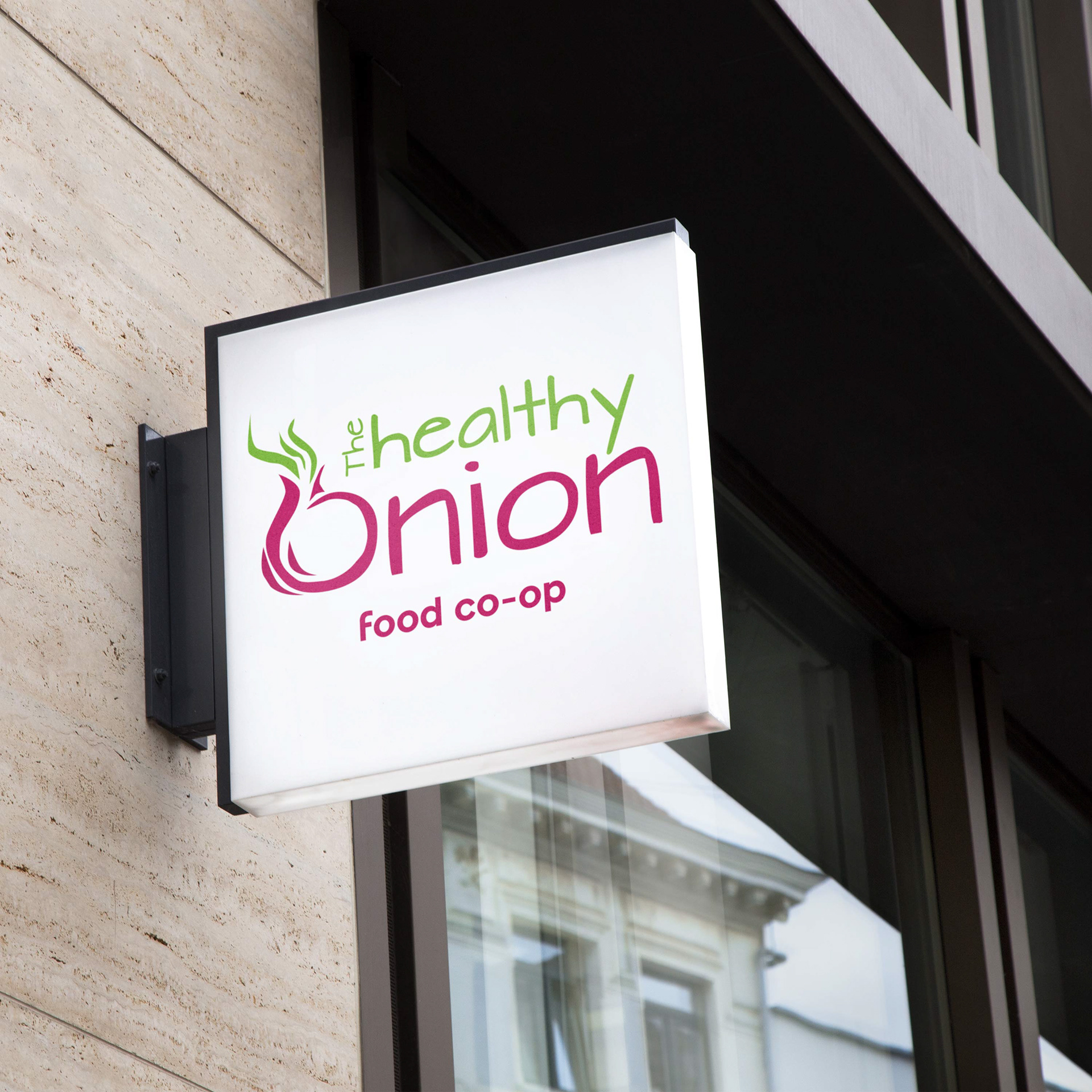
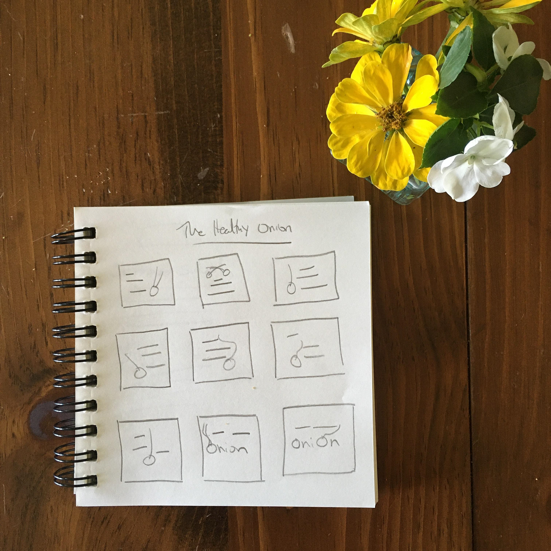
The logo is clean and modern. An onion graphic is incorporated into the typography, while still keeping the logo readable. The bright green and magenta echo the colors of an onion while being a bit brighter, giving the logo an open, welcoming vibe. Green and magenta are the brand colors.
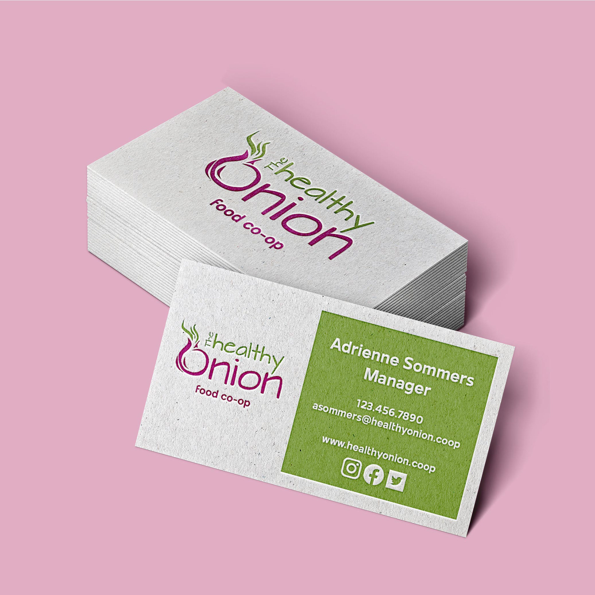
I chose a letterpress business card design for The Healthy Onion. The texturing gives the card an organic, natural look and feel, while the clean lines of the logo and text keep the card modern and easy to read. I used green as the color for the cards, letting the magenta of the logo stand out.
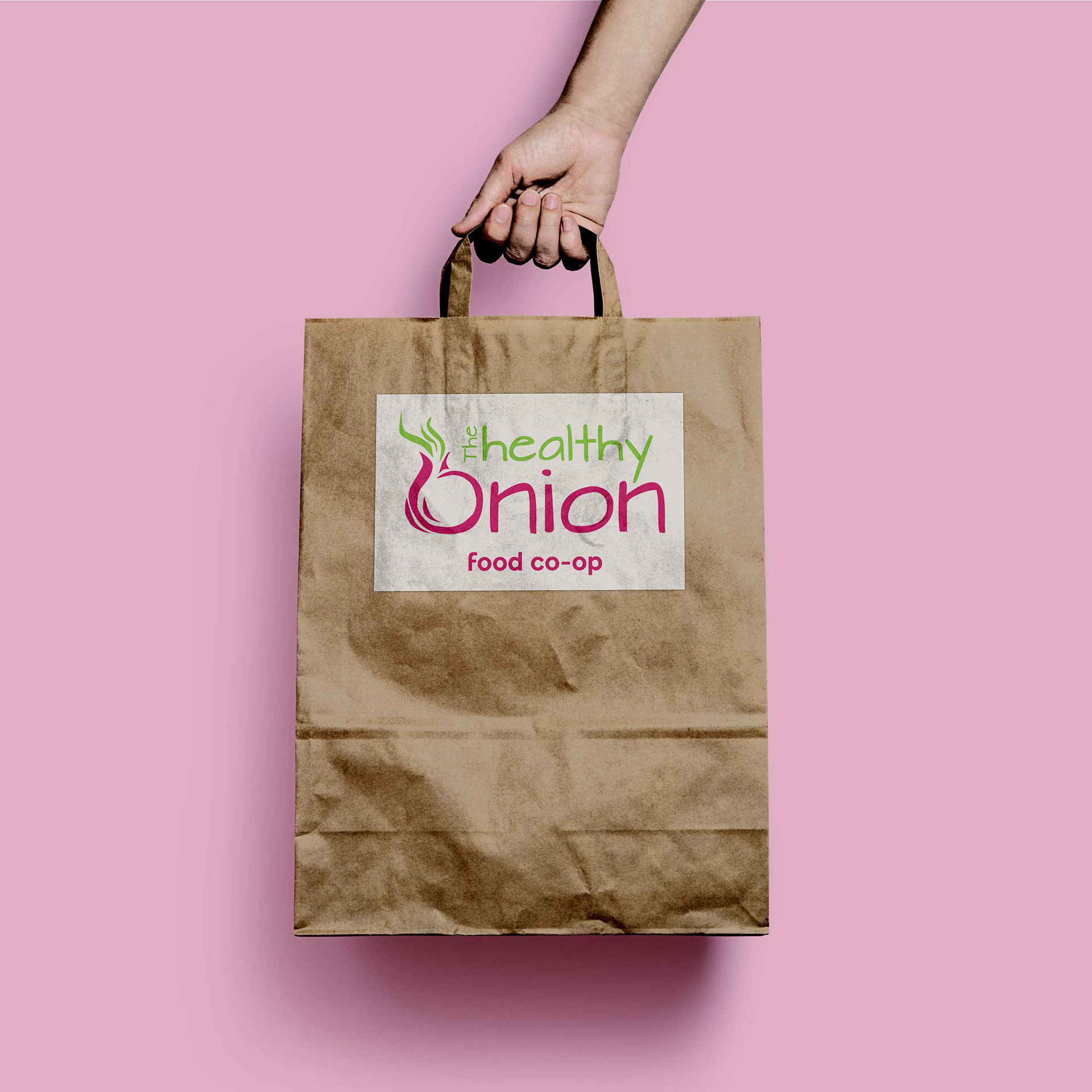
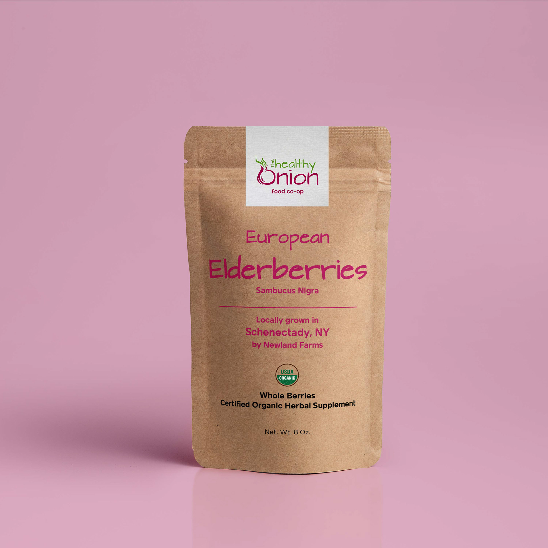
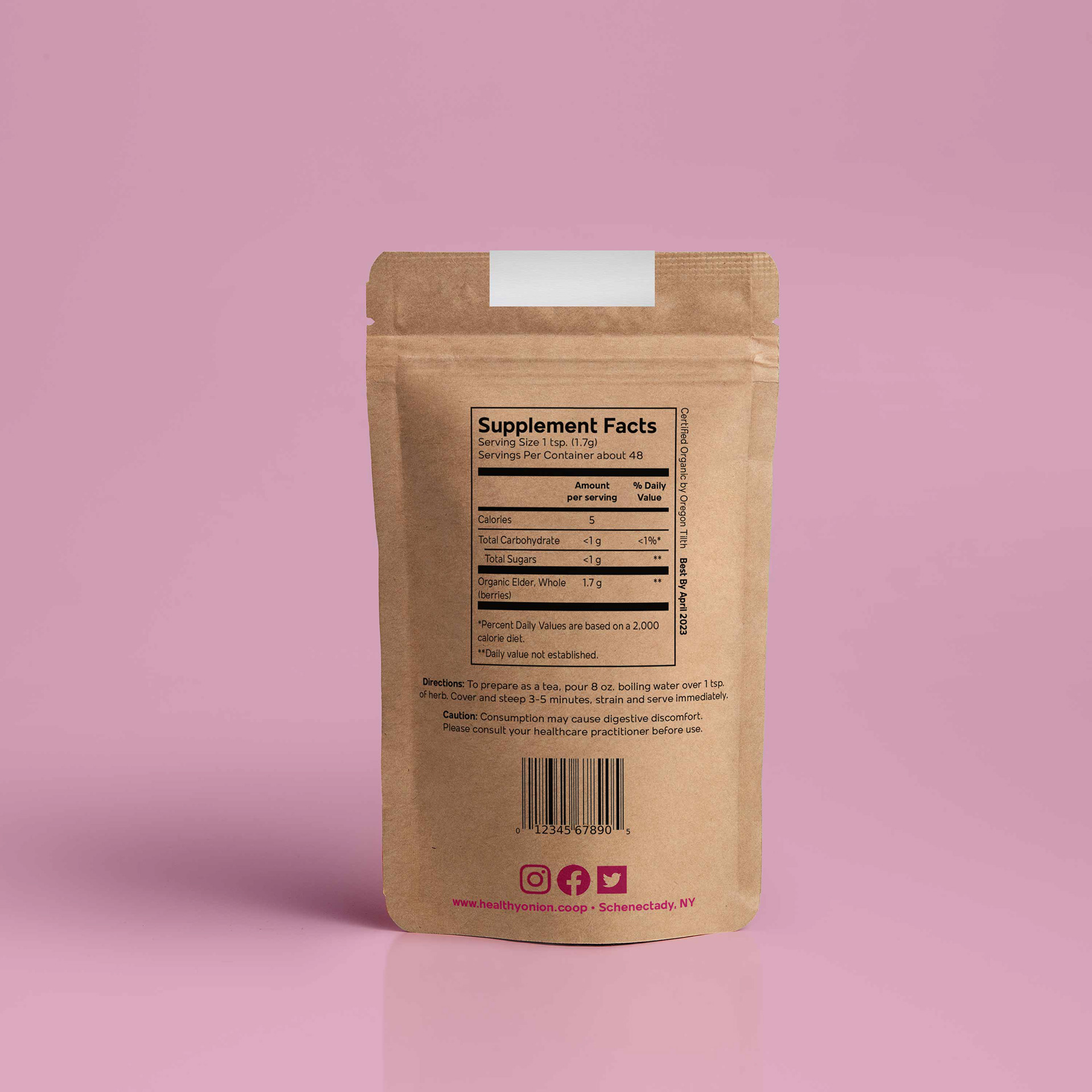
Packaging for The Healthy Onion is brown paper bags, which are recyclable. The food packaging uses the magenta in the item name and as a pop of color on the back for the social media icons, web address, and location. Lesser informational verbiage is in black.
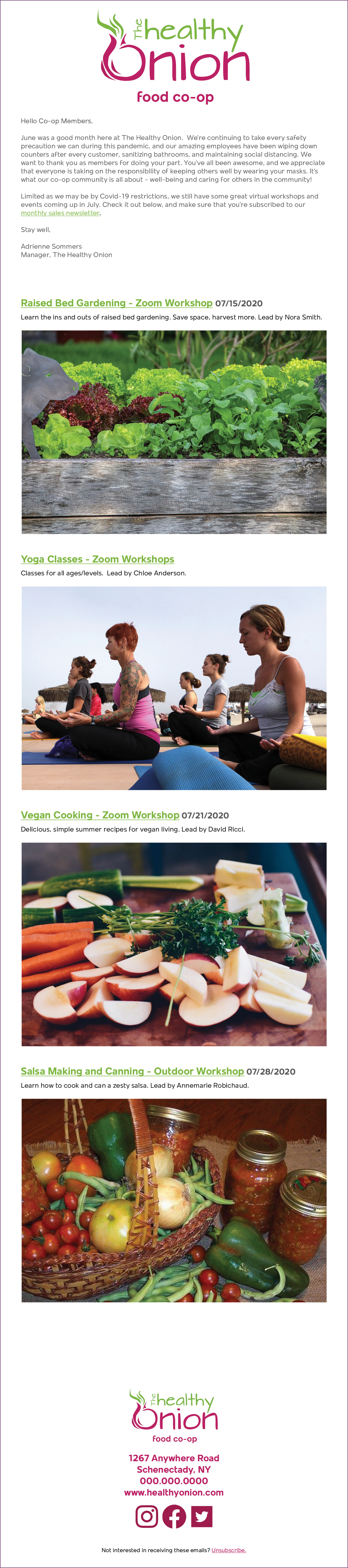
Emails from The Healthy Onion are clean and modern. Photo heavy, they offer minimal information about classes and events with links provided for those who are interested in more details. Links are in green and underlined, making it clear to the viewer that they are clickable.