
About Me
December, 2019
Hi! I'm a graphic designer and artist with a love for gardening, the outdoors, and crafting. Designs that have an organic, whimsical feel are my favorite to create, but I also like to challenge myself and take a crack at something outside of my comfort zone every once in a while. This blog is an extension of my recent passion projects. I've been creating designs for the sake of designing, exploring my own style, and growing as an artist and designer. Please enjoy!
The Healthy Onion - Brand Identity
7/9/2020
Food Co-ops hold a place near and dear to my heart. I’ve shopped, volunteered, and worked at them. I love the co-op smell. Produce, tea, spices, and anything and everything from the bulk section mixing together to create that distinct, heady aroma. Co-ops are a community experience. Connections are made and local businesses are supported. I can’t say enough good things about them!
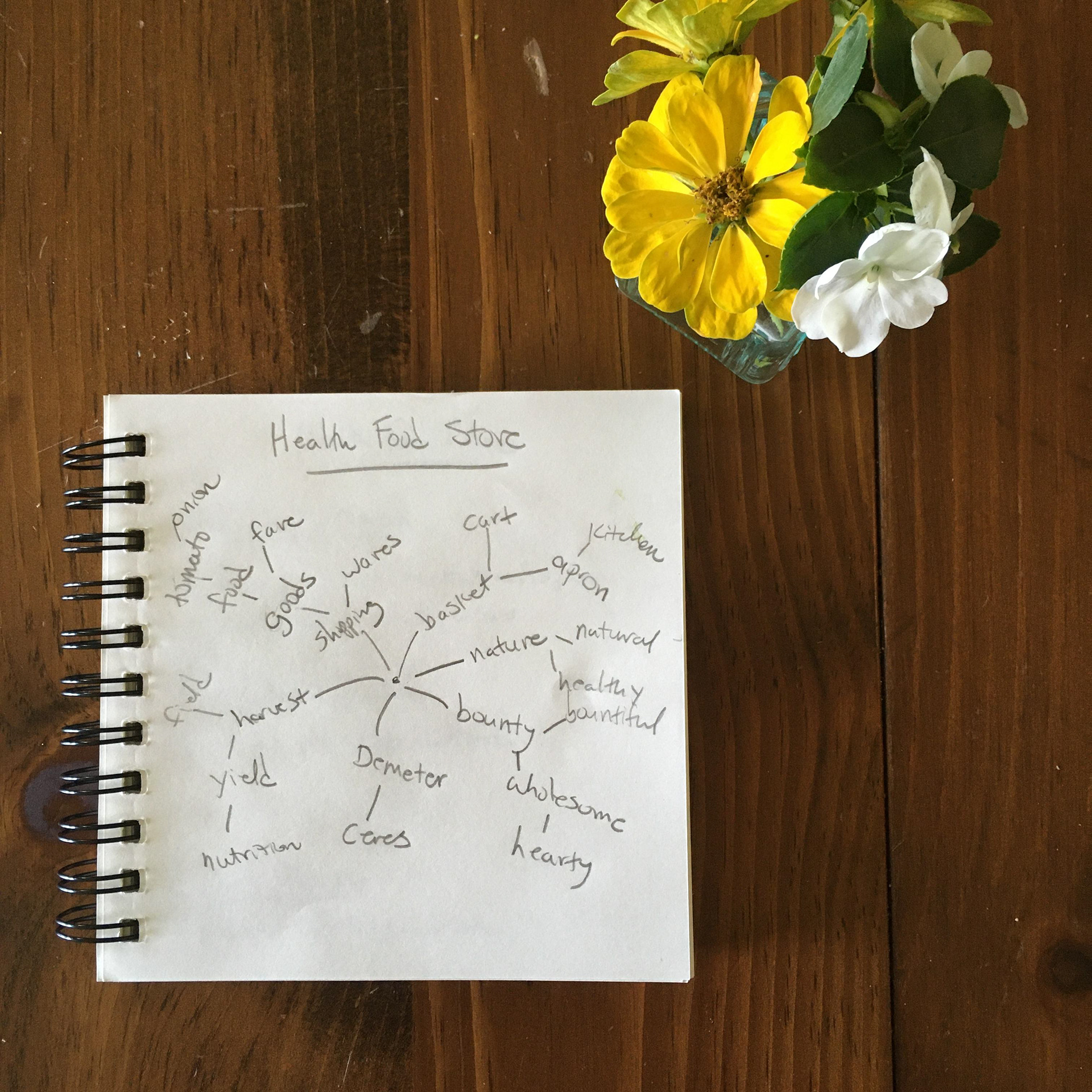
Mind Map
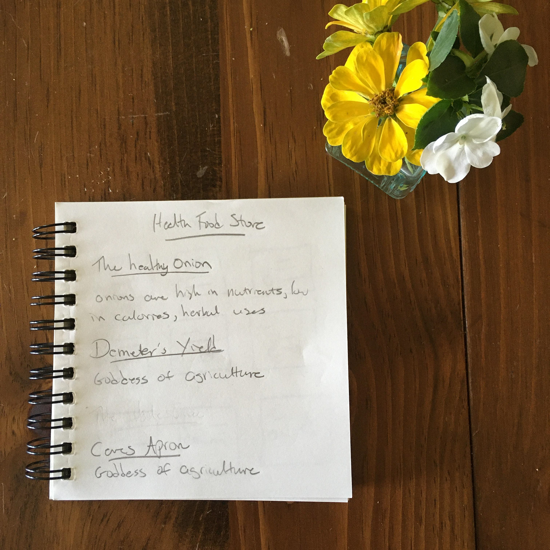
Narrowing Down
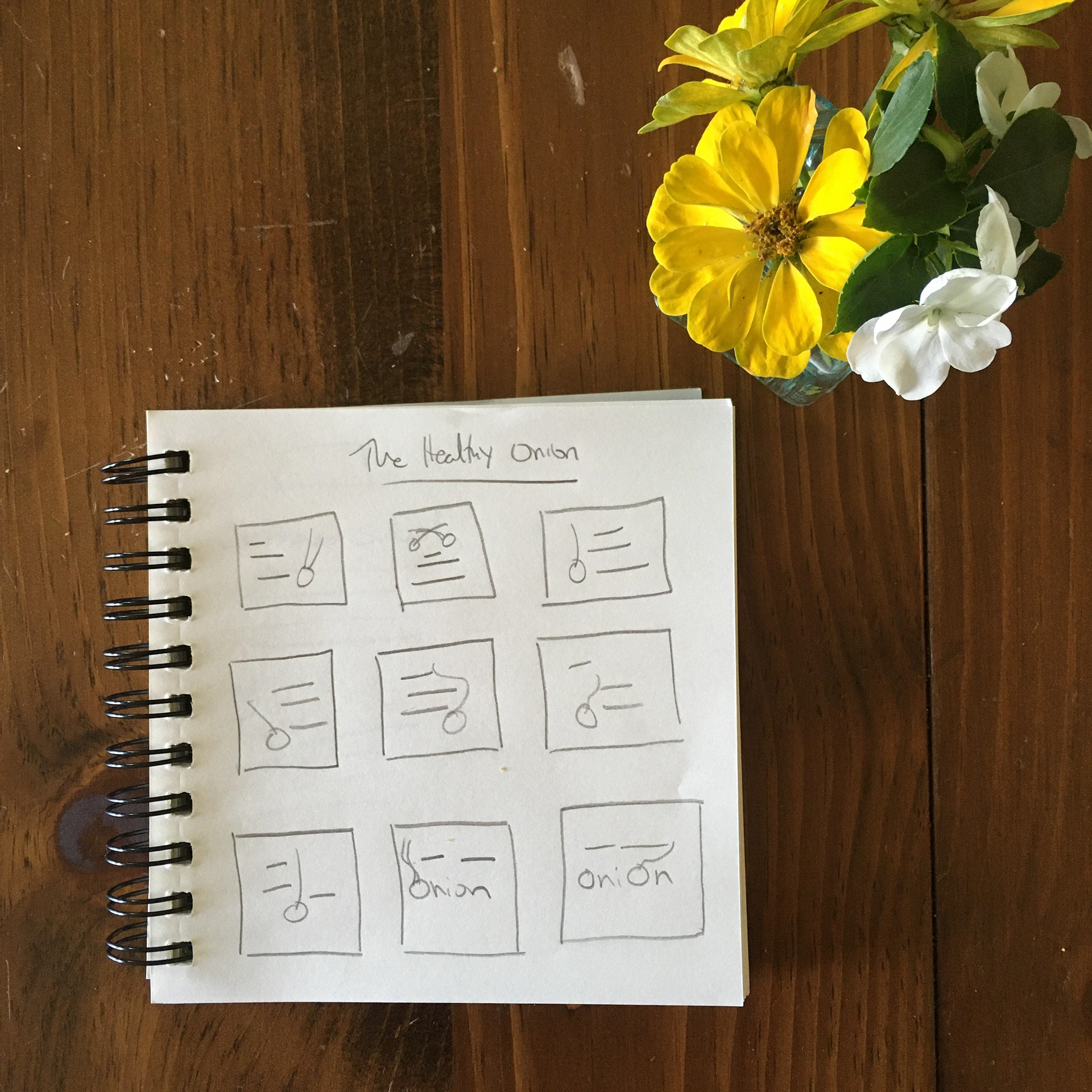
Thumbnails
This brand identity for The Healthy Onion Food Coop started out with some mind-mapping. What’s a fun and original name for a food co-op? I had three contenders – “The Healthy Onion”, “Demeter’s Yield”, and “Ceres’ Apron”. The Healthy Onion won out. Onions are high in nutrients and are used in both cooking and herbalism, something that would speak to the health conscious co-op demographic.
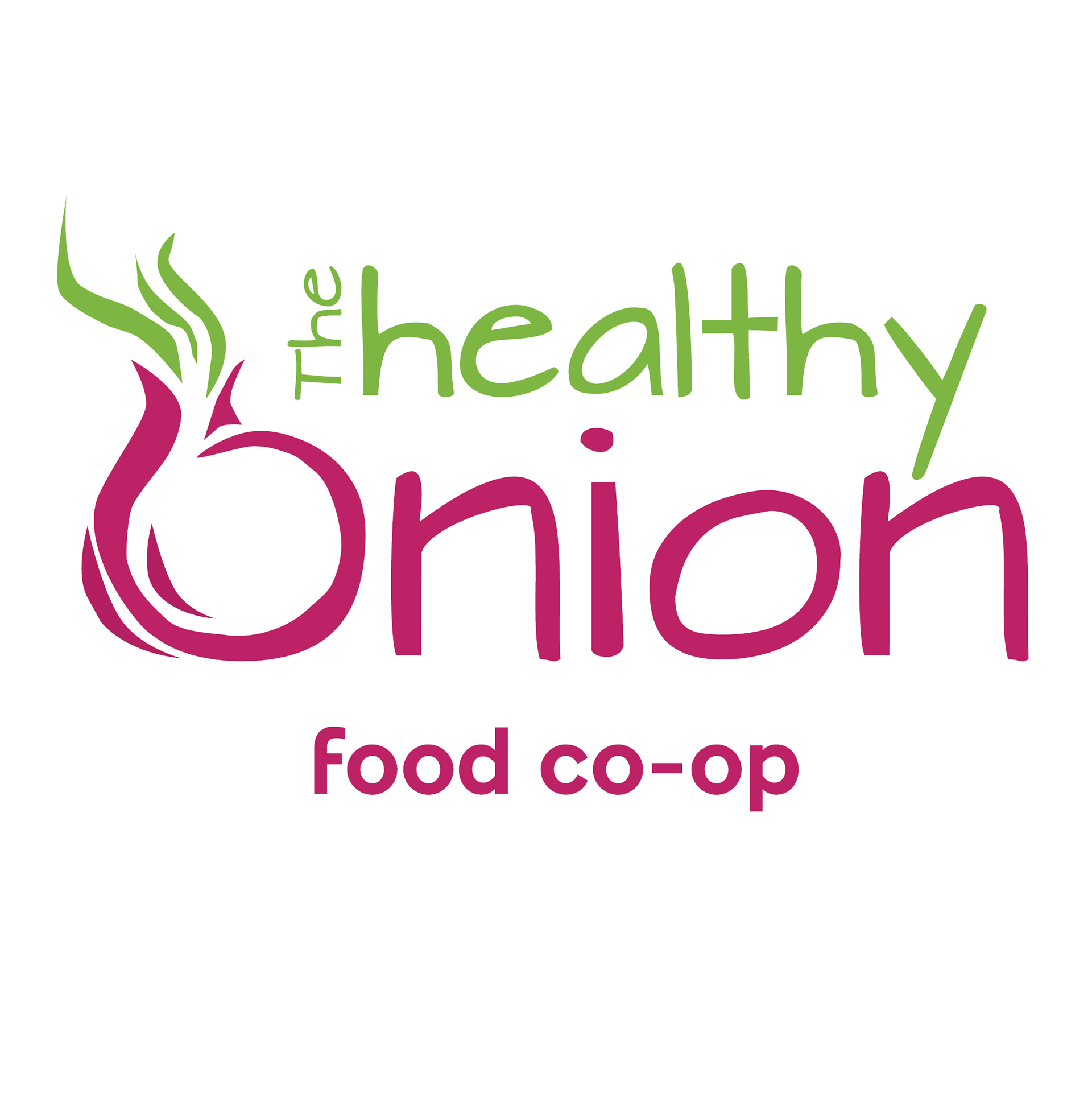

The logo is clean and modern. An onion graphic is incorporated into the typography, while still keeping the logo readable. The bright green and magenta echo the colors of an onion while being a bit brighter, giving the logo an open, welcoming vibe. Green and magenta are the brand colors.
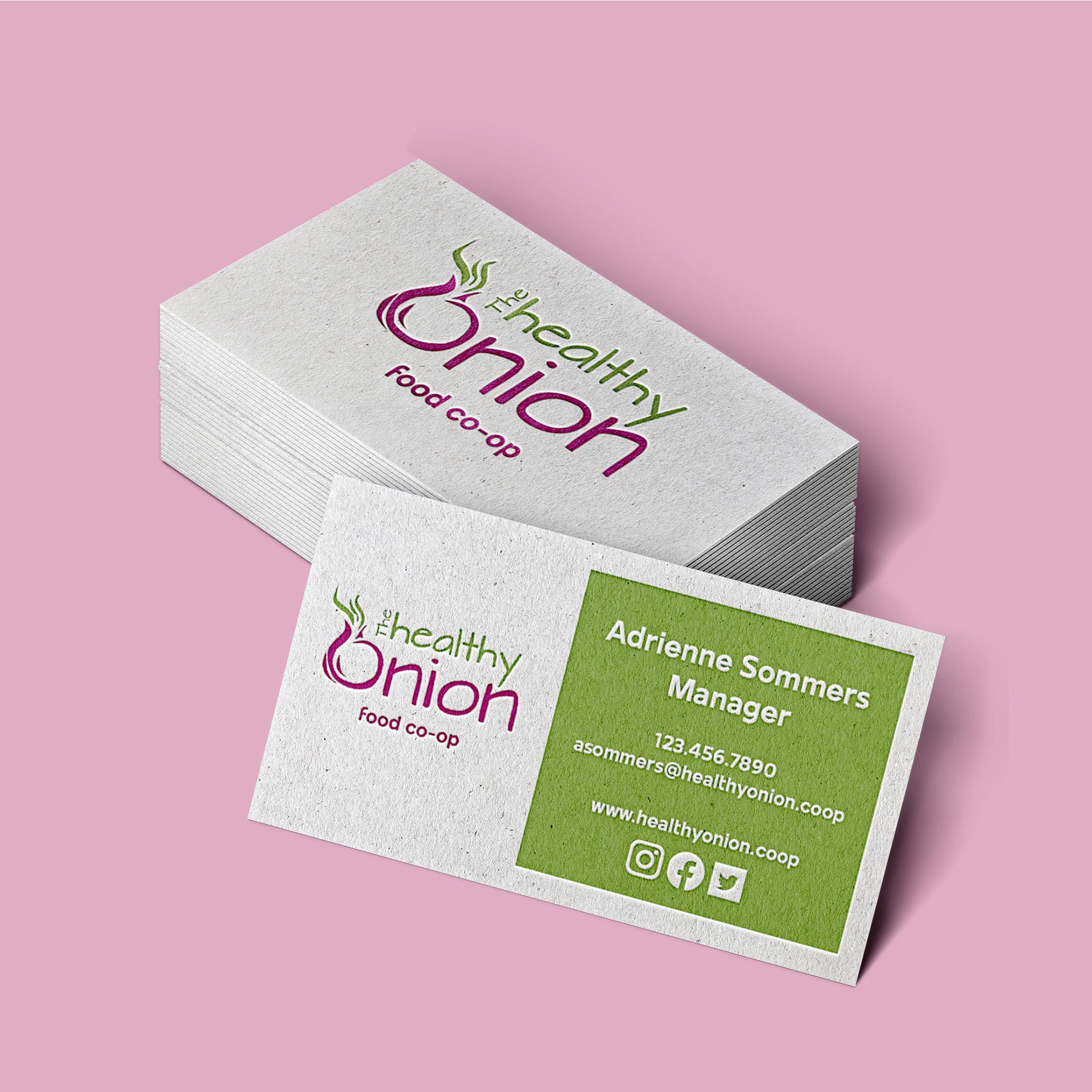
I chose a letterpress business card design for The Healthy Onion. The texturing gives the card an organic, natural look and feel, while the clean lines of the logo and text keep the card modern and easy to read. I used green as the color for the cards, letting the magenta of the logo stand out.
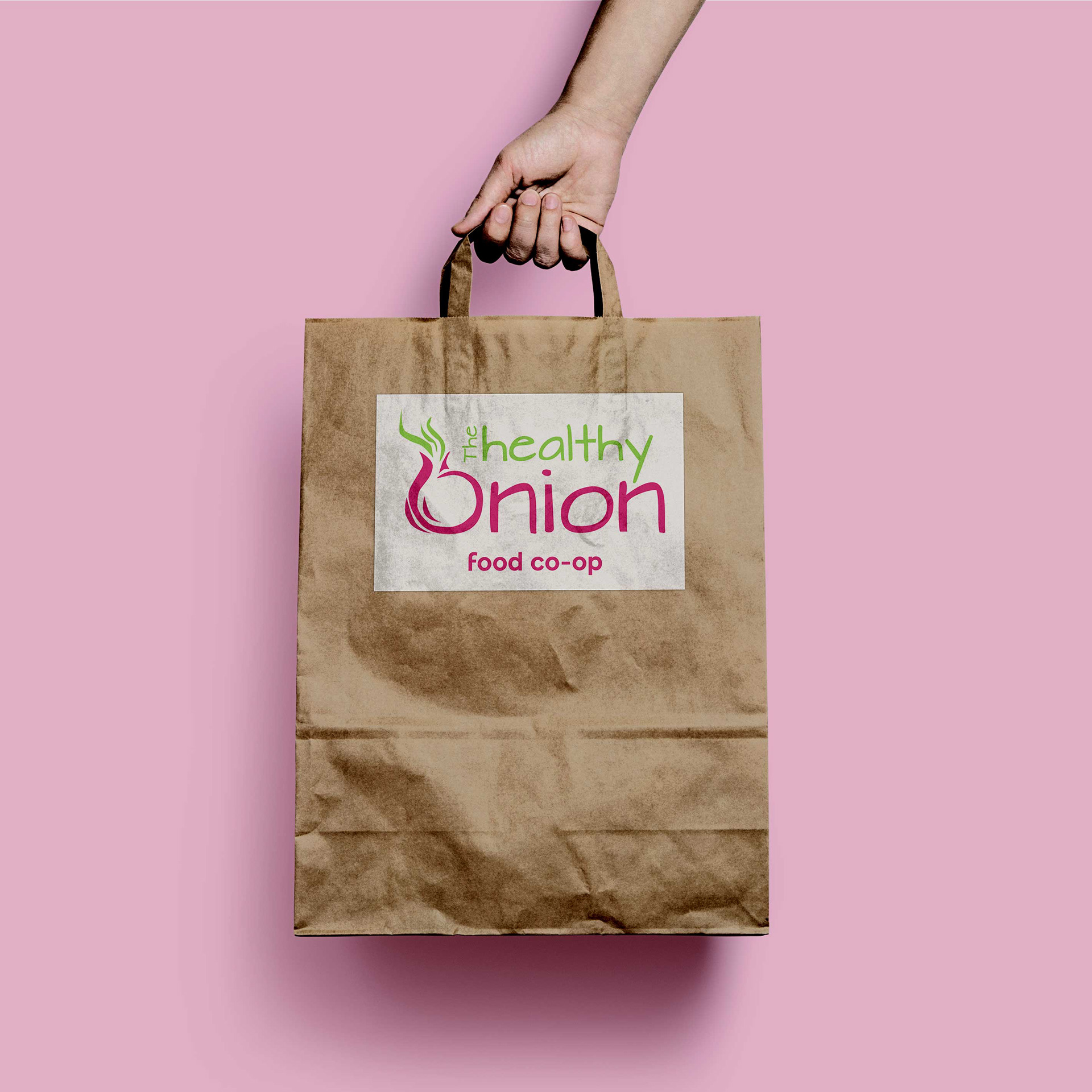

Packaging for The Healthy Onion is brown paper bags, which are recyclable. The food packaging uses the magenta in the item name and as a pop of color on the back for the social media icons, web address, and location. Lesser informational verbiage is in black.
I’m excited about this brand identity! My plan is to work on digital marketing materials for the brand next. In the meantime, I’m about to go make an iced chai latte and try to stay cool in this July heat!
I’m excited about this brand identity! My plan is to work on digital marketing materials for the brand next. In the meantime, I’m about to go make an iced chai latte and try to stay cool in this July heat!
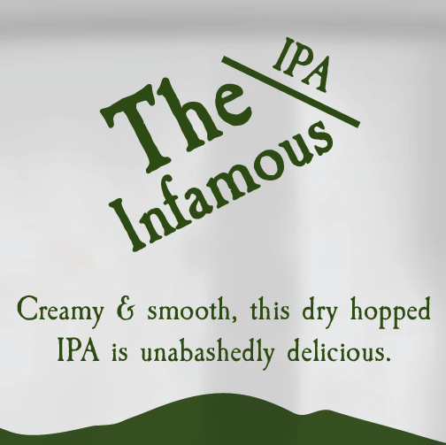
The Infamous - Package Design
5/17/2020
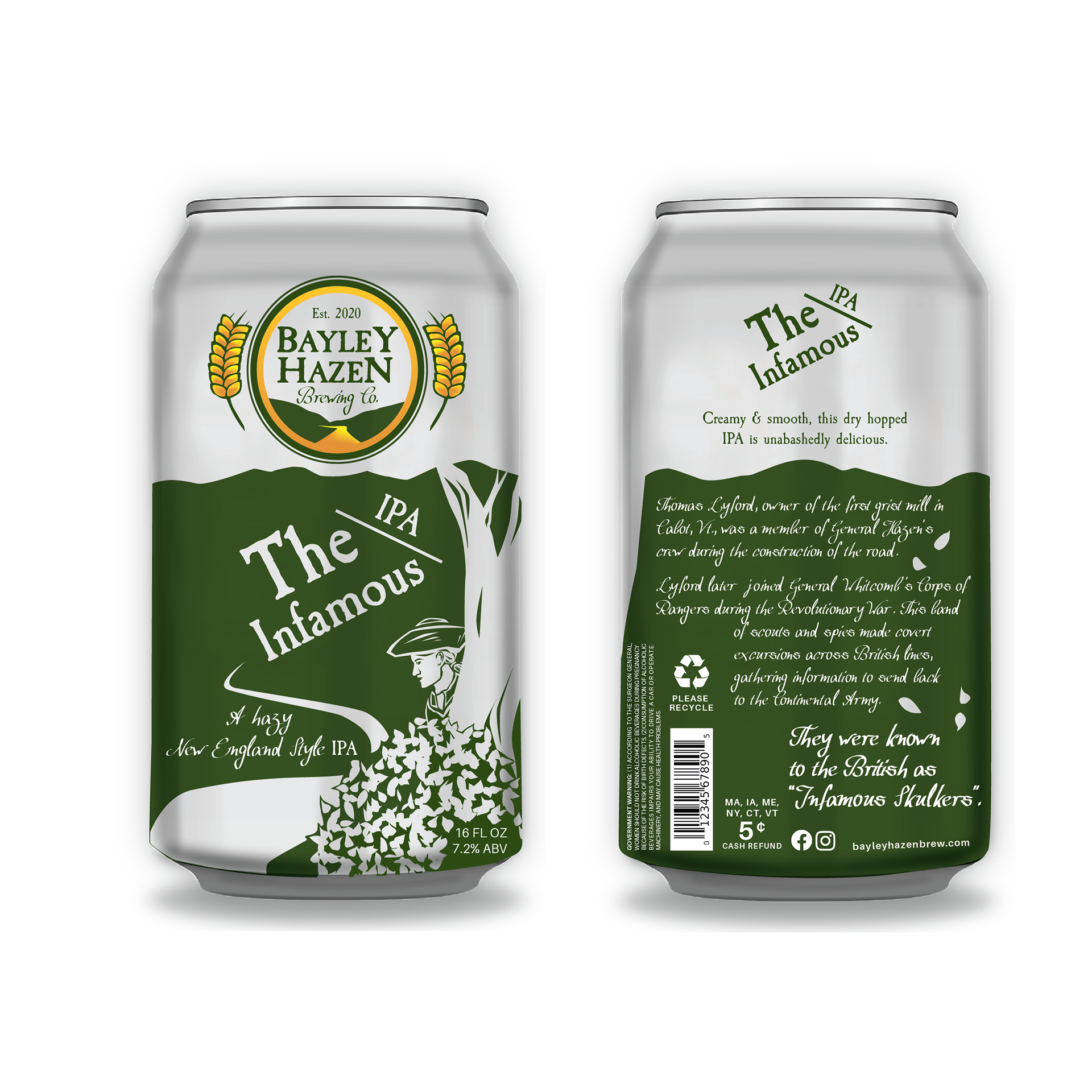
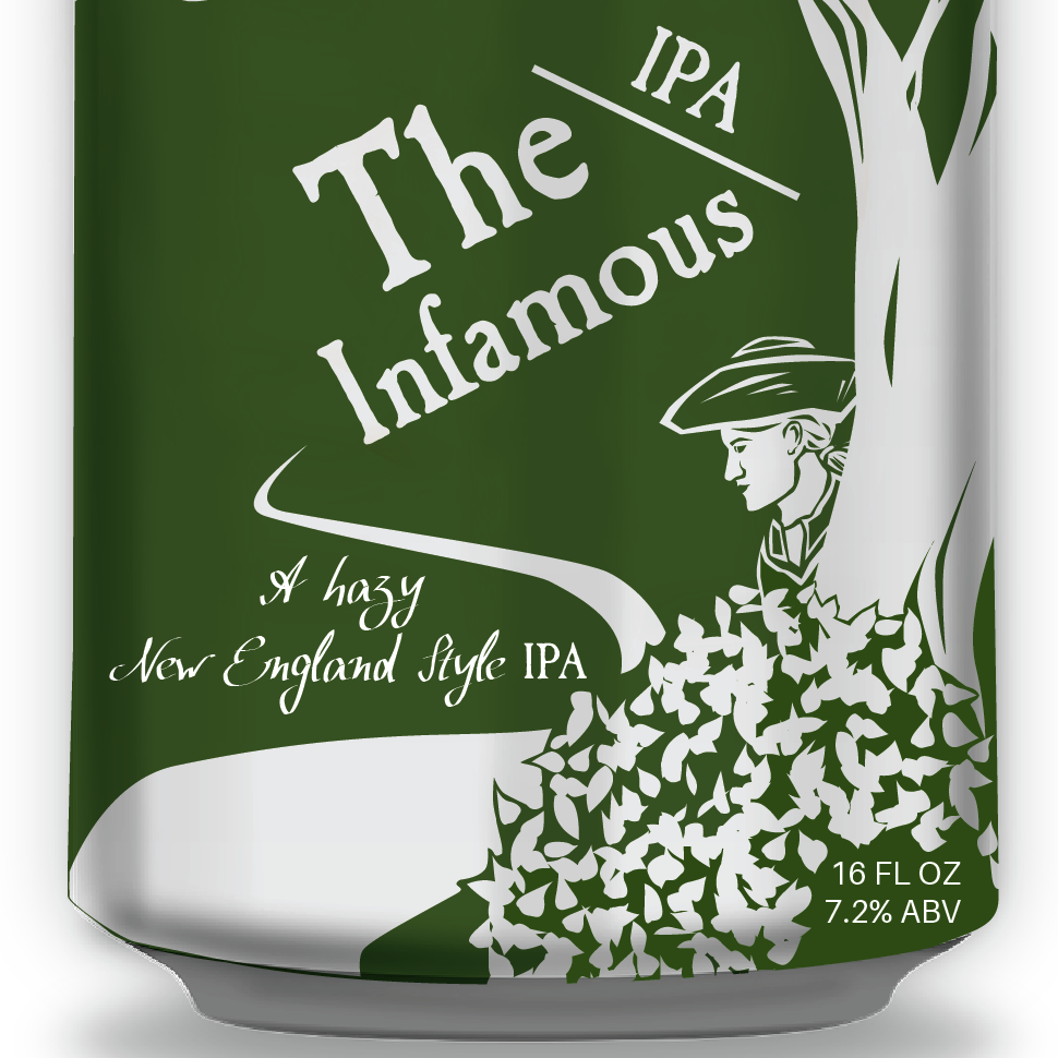
The last Bayley Hazen Brewing Co. beer for this project is The Infamous, a New England Style IPA. Named after the nickname the British had for the group that would become Whitcomb’s Rangers, The Infamous is a New England Style IPA.

Thumbnails

Thumbnails
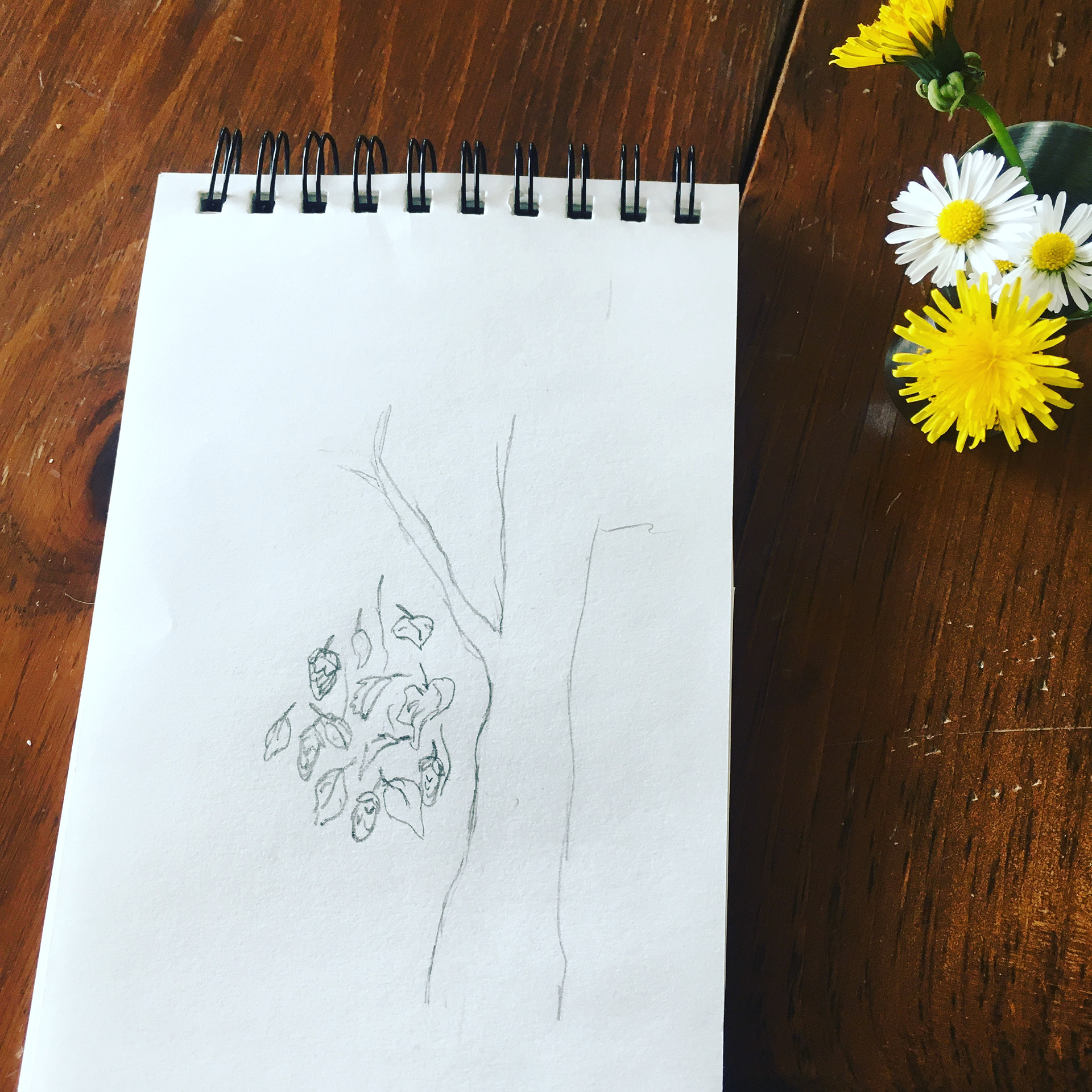
Sketching
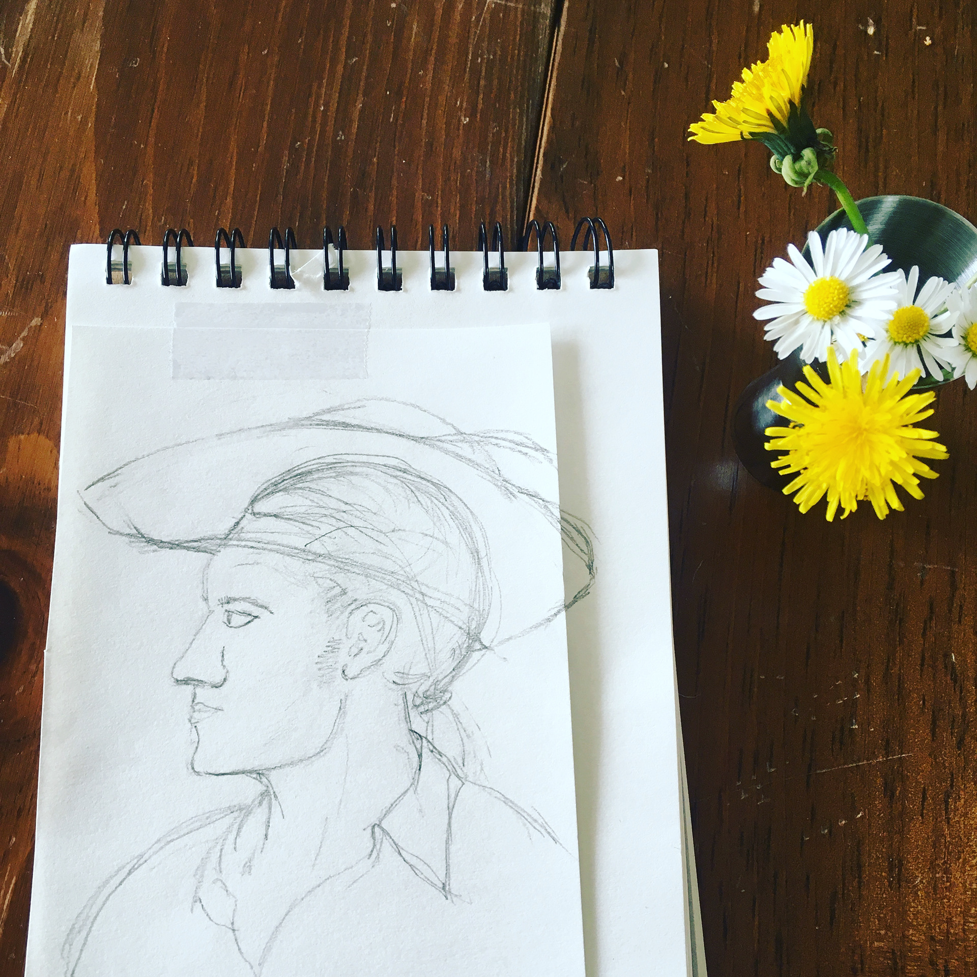
Profile
Can I just say how excited I am that there were some flowers on the table, picked while on a lovely spring walk yesterday, to put beside my sketches in these photos? Yes, spring!
I played around with a few ideas for this design. One was to have a scout peering out from behind a curtain of hops... another was to include a moon above the mountains, indicating the night scouting and other sneaking about. Ultimately I decided on a scout peering out from behind a tree and shrubbery. The simpler concept blends well with the three existing packaging designs, and makes more sense with the mountainous background, depicting the wooded terrain of the green mountains.
I played around with a few ideas for this design. One was to have a scout peering out from behind a curtain of hops... another was to include a moon above the mountains, indicating the night scouting and other sneaking about. Ultimately I decided on a scout peering out from behind a tree and shrubbery. The simpler concept blends well with the three existing packaging designs, and makes more sense with the mountainous background, depicting the wooded terrain of the green mountains.
Front
Back
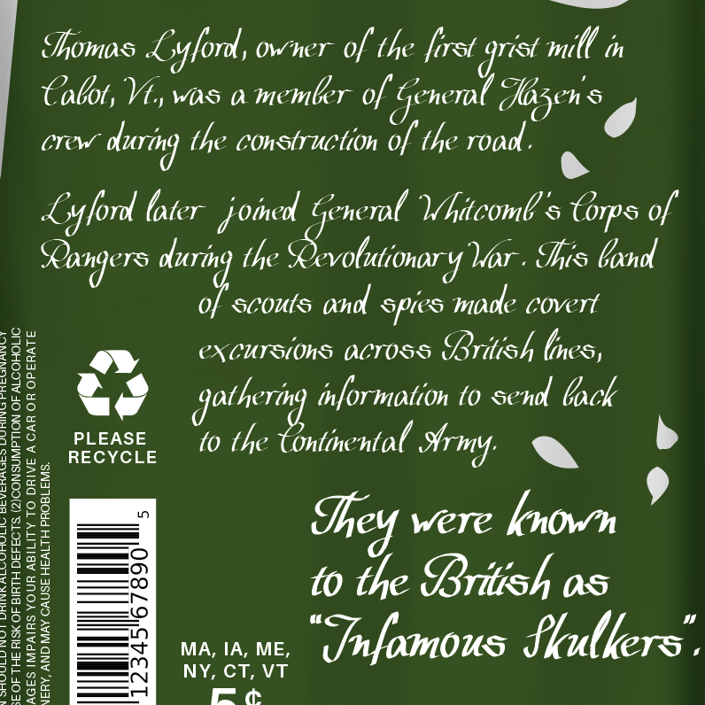
Story
The Vermont state colors are green and gold, which ties in well with this packaging concept. And now, here they are, all four designs together!

Mile 73

Wedding Kettle

Smugglers

The Infamous
Smugglers - Package Design
4/10/2020
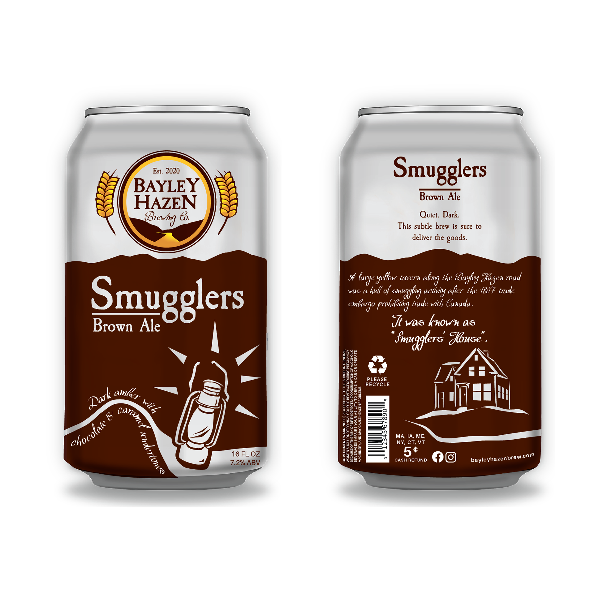
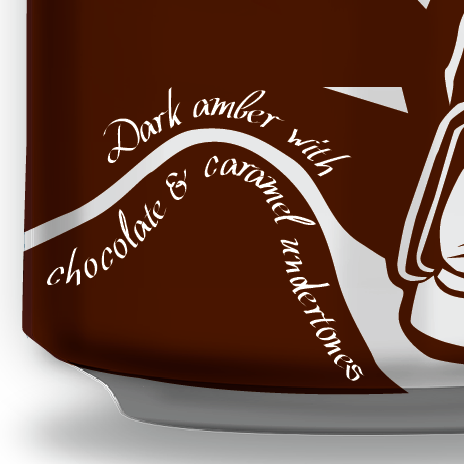
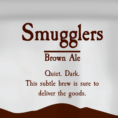
Here it is, the third installment of the Bayley Hazen Brewing Co. package design, Smugglers Brown Ale. This brew is a dark amber with chocolate and caramel undertones. A good hearty ale, it would be a fitting drink for the winter months. Which seem reluctant to leave us quite yet, if the snow on the lawn outside this morning was any indication.
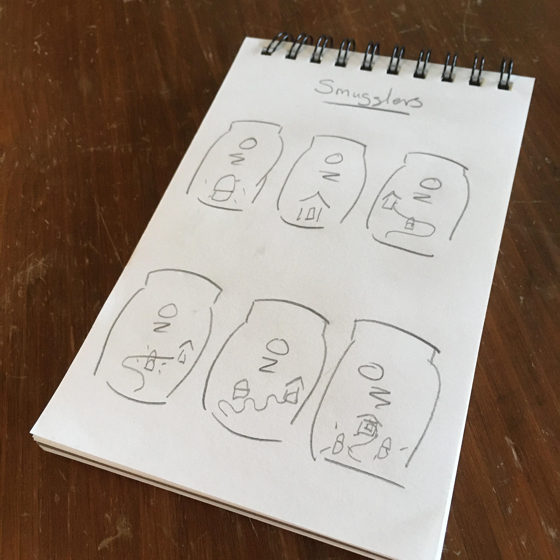
Thumbnails
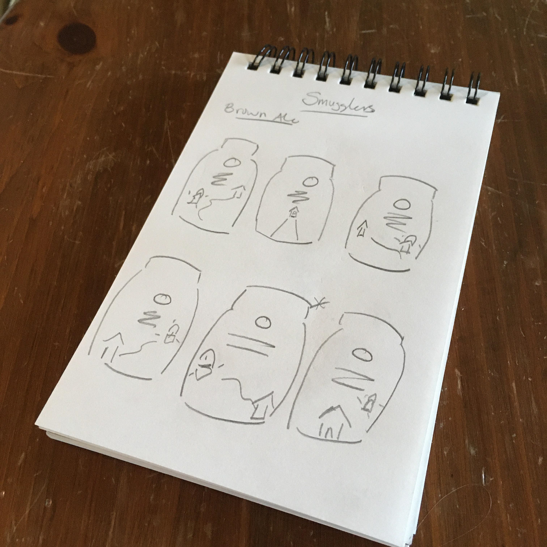
Thumbnails

Sketch
As usual, my process began with some quick sketches, to get a general idea of layout, and think a bit about what components I wanted to include in the design.
Front
Back
Story
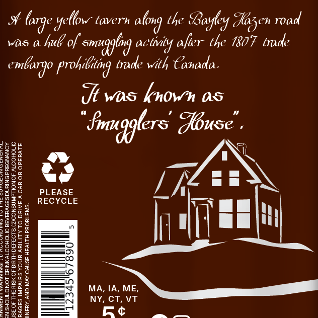
Based on stories of smuggling activity that took place in the 1800s along the Bayley Hazen Road, the packaging for this beverage features a lantern hovering over the road, as might be seen as smugglers traveled through the night on their way to Canada. The lantern balances the text on the left, and the description of the beverage follows the curve of the road, adding a feeling of movement. The road wraps around to the back of the can and past the “Smugglers’ House”, where the windows shine bright. The residents are awake and ready for travelers! Perhaps there is a cask of ale that can be tapped...
Mile 73

Wedding Kettle

Smugglers
Three out of my planned four brews are now done!
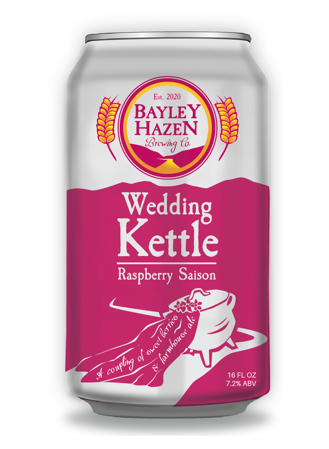
Wedding Kettle - Package Design
4/3/2020
It’s day six of not leaving the apartment for anything but a run or walk. Thank goodness for sunny days and Zoom.

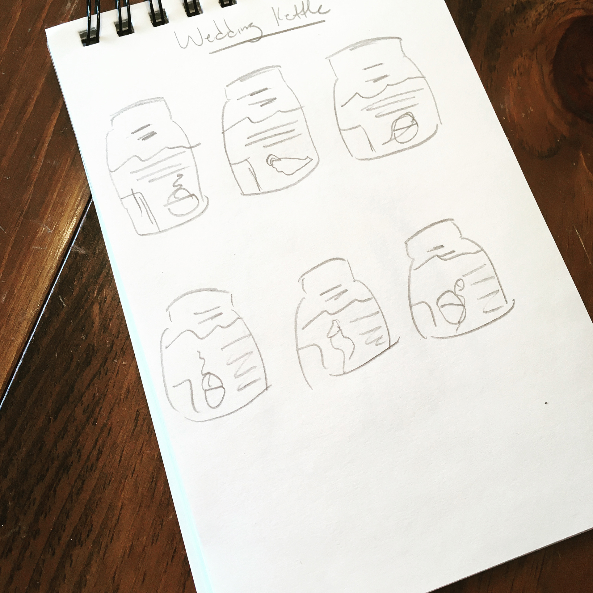
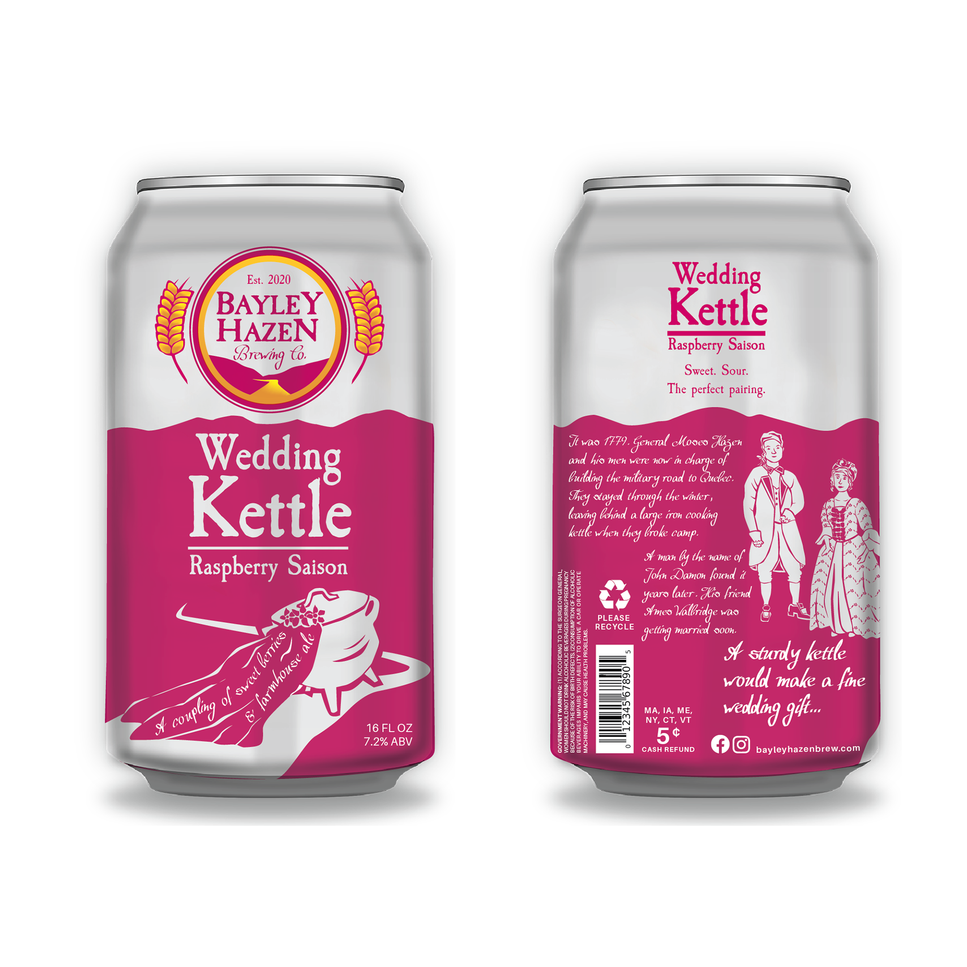
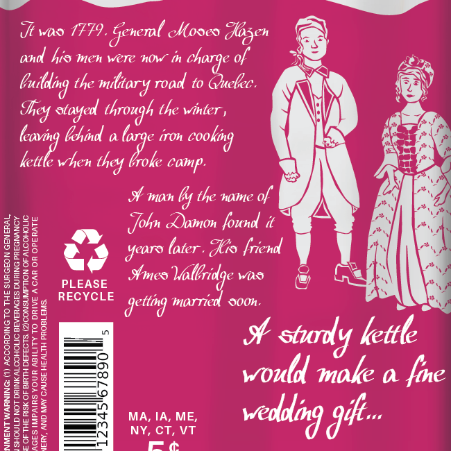
Announcing the second brewski in this packaging project of mine - Wedding Kettle Raspberry Saison. As the story goes, Moses Hazen and his men left a cooking kettle behind on the Bayley Hazen road after they took over the construction of the road. The kettle was found by a man named John Damon, who later gave the kettle to Ames Walbridge as a wedding gift. My source for this tale and others about the Bayley Hazen road is a very interesting North Star Monthly article. Yay small town papers!
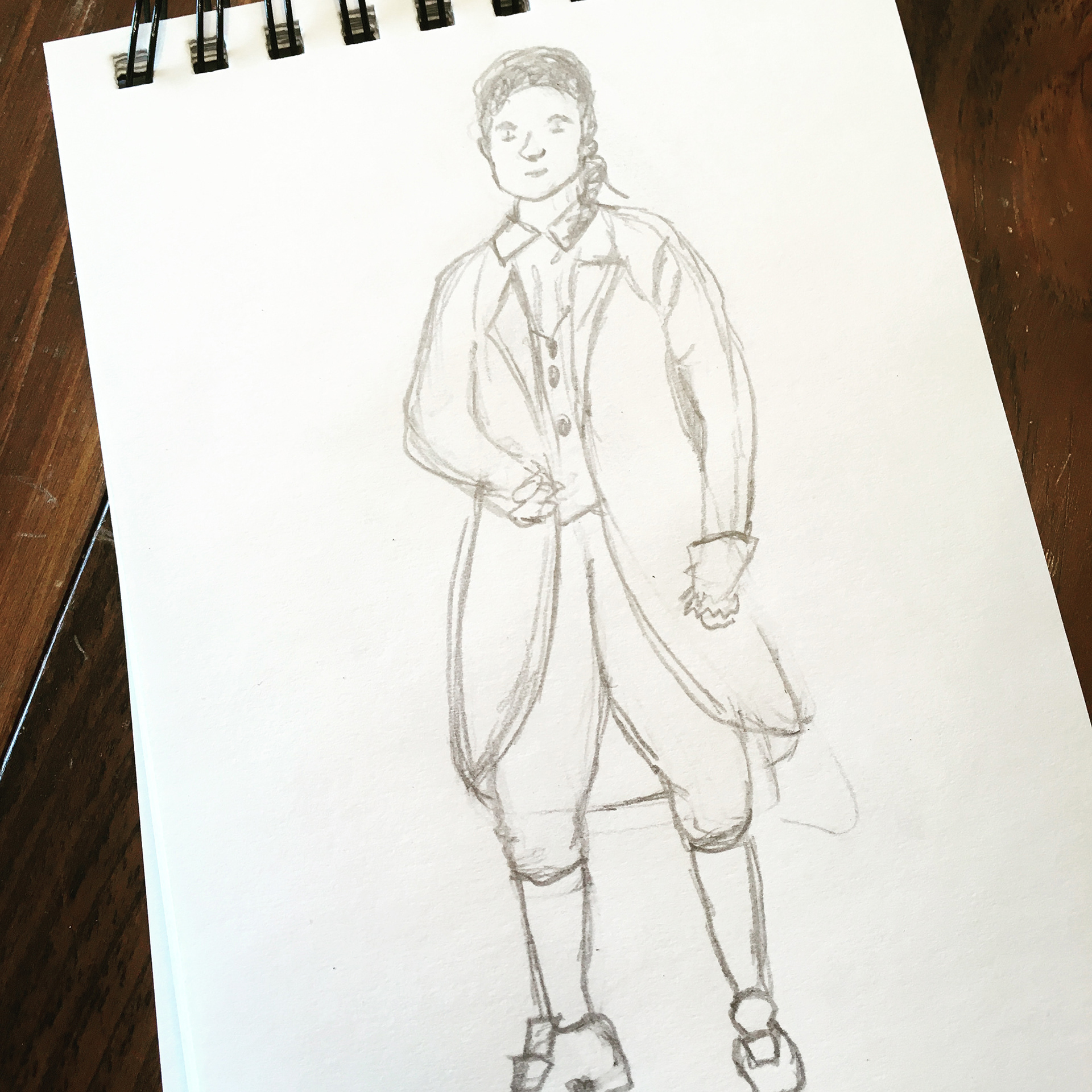
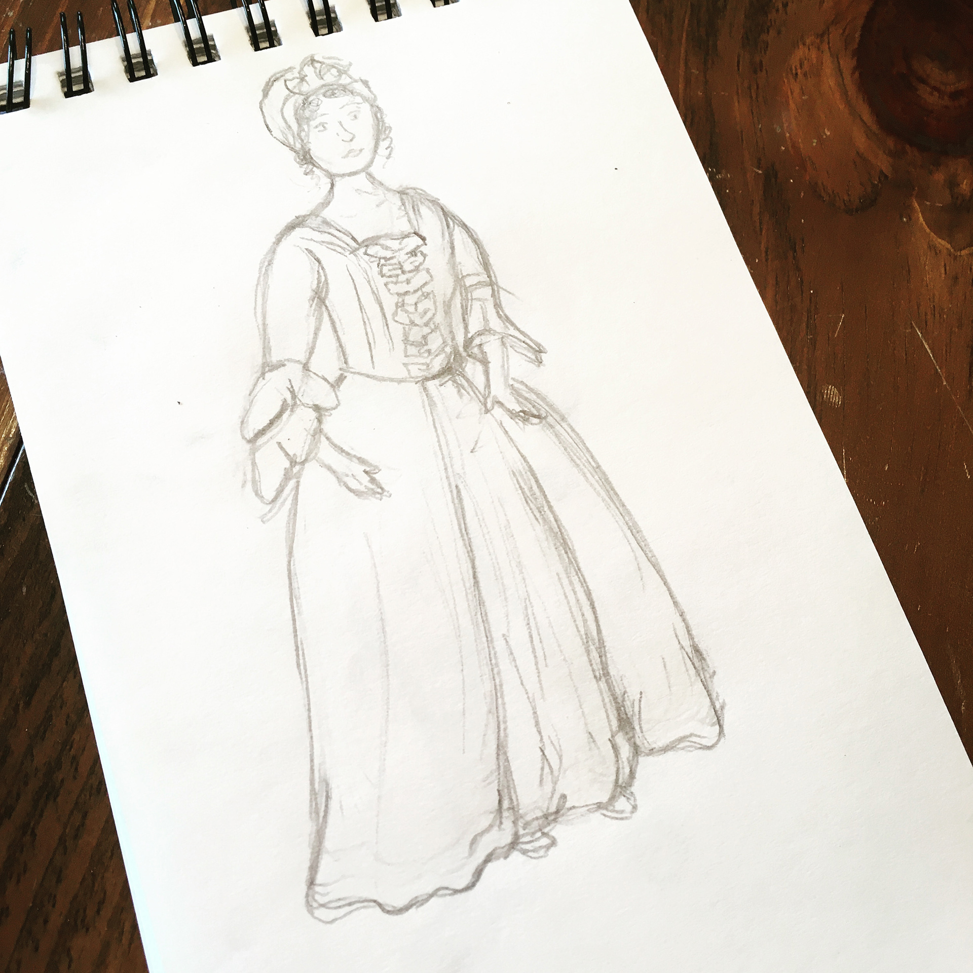
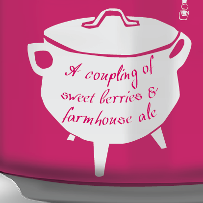
I knew that I wanted to incorporate a 1700s/early 1800s couple into the design, as well as an old cooking kettle. I had some fun researching 1700s to early 1800s wedding dresses, and I chose the one that stood out to me most, a dress worn by Sarah Tyng Smith in 1763, to be my main inspiration. A little before this story on our timeline… but still in keeping with the general style of early 1800s wedding dresses. The man’s clothing is colonial, my main inspiration being drawn from line drawings. The kettle is a cooking kettle, not to be confused with a tea kettle.
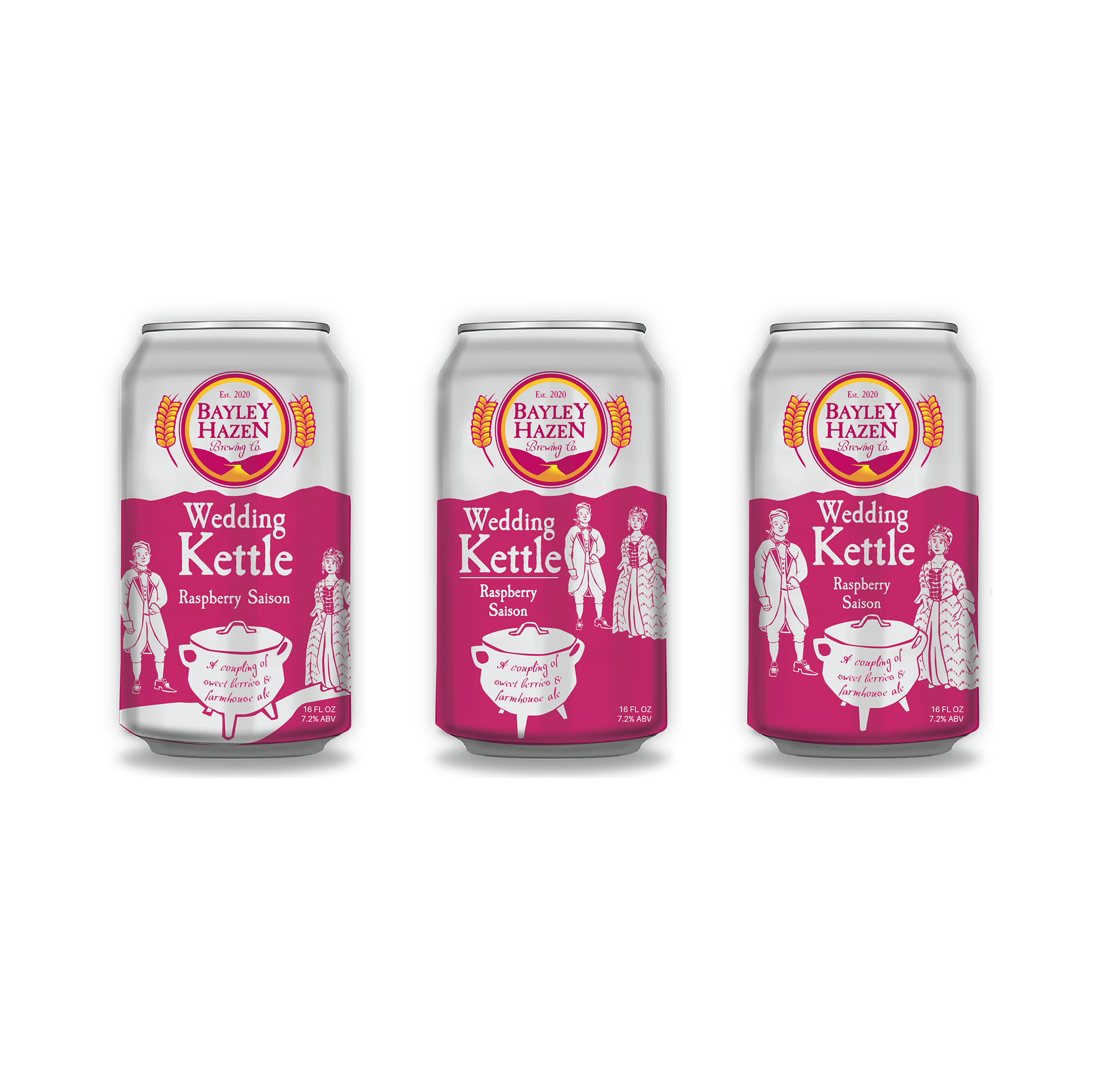
I used a dark fuschia as the color for this product, which builds anticipation for the juicy, fruity saison inside. It was fun to create a wedding themed play on words while writing the drink description copy. I played around with a few designs.

Mile 73
Wedding Kettle
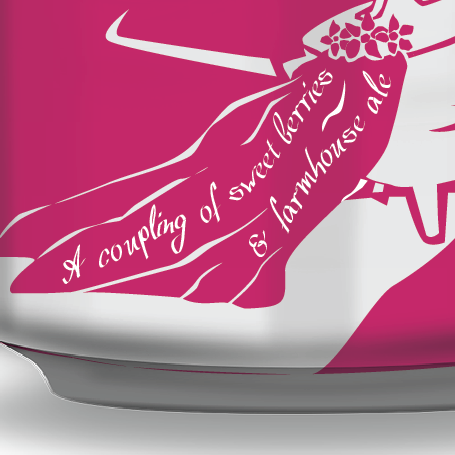
I was feeling that the balance was off with the couple and the kettle competing with the text for attention. The design lacked flow, and I wanted the white space to match the Mile 73 design more closely for a strong overall packaging unit. I tried another approach, adding a veil to the kettle and moving the couple to the back of the can for my final design. The kettle dancing down the road in a wedding veil added a zany, whimsical element that is fitting for beer packaging.


Back
Story
Front
Another quarantine project complete! Now to gather up the nerve to brave the grocery store…
Mile 73 - Package Design
3/30/2020
I just completed another self-imposed week-long sketch a day challenge, and the creative gears are rolling. Time to pick up where I left off on the Bayley Hazen Brewing Co. branding project!
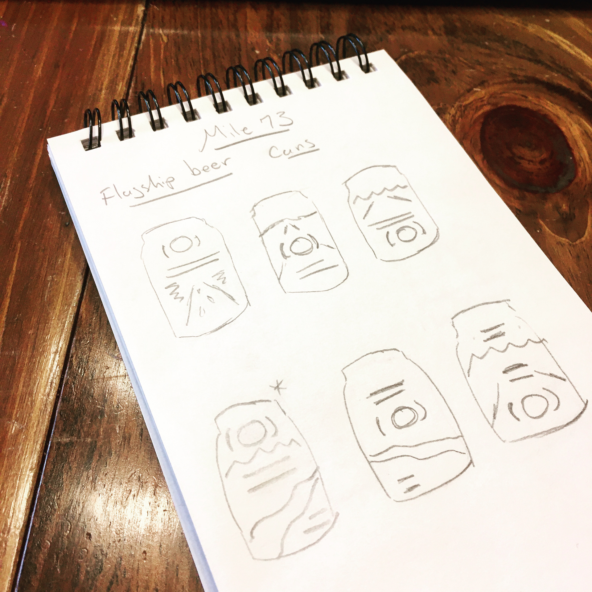
Thumbnails
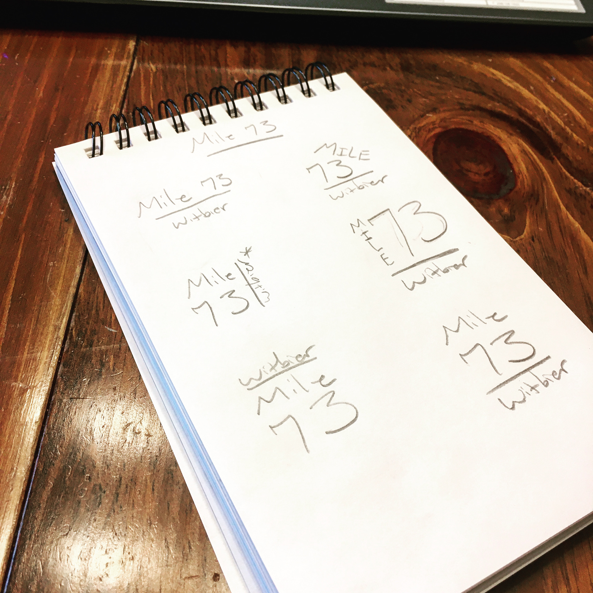
Typography
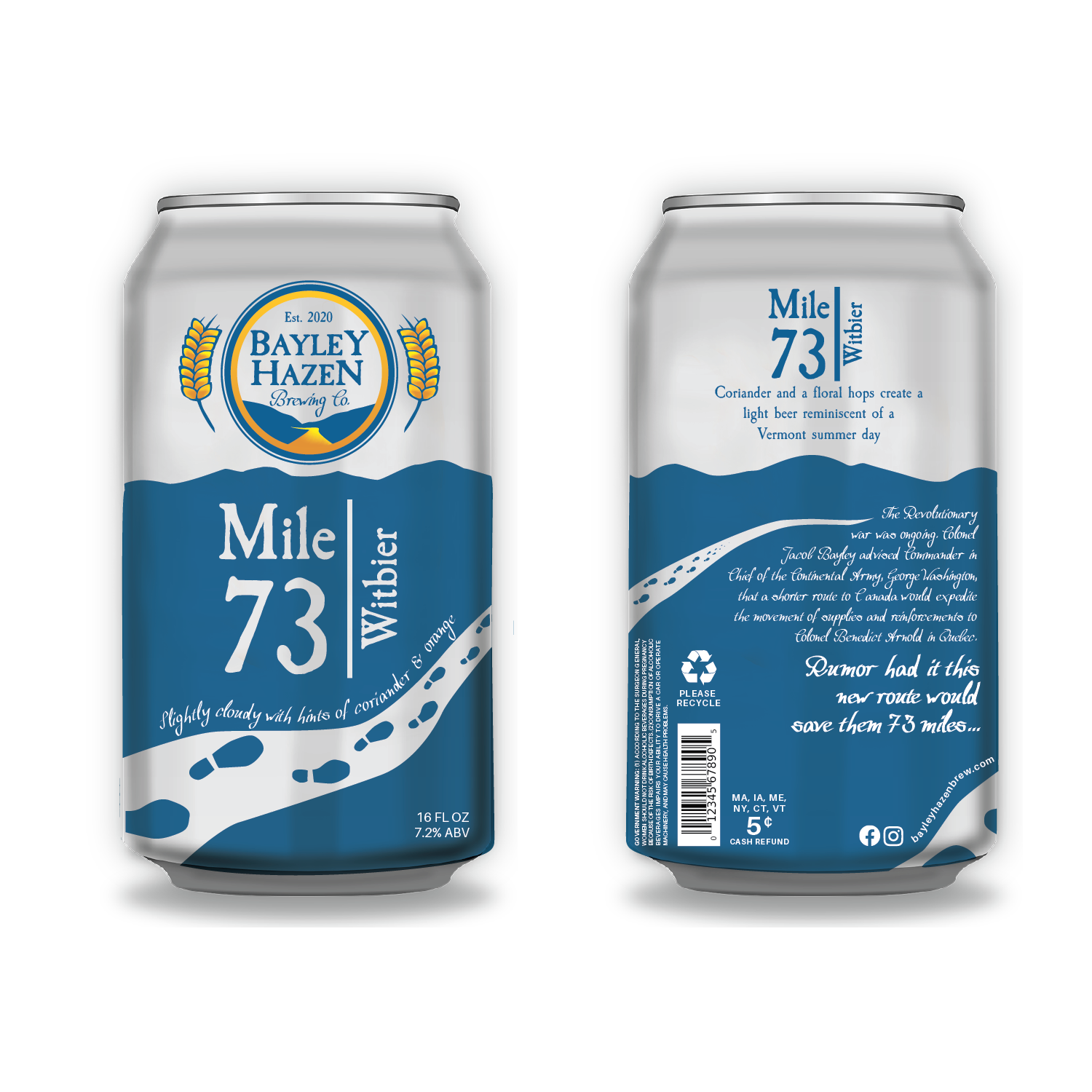
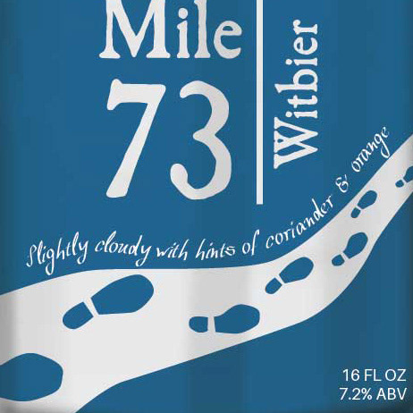
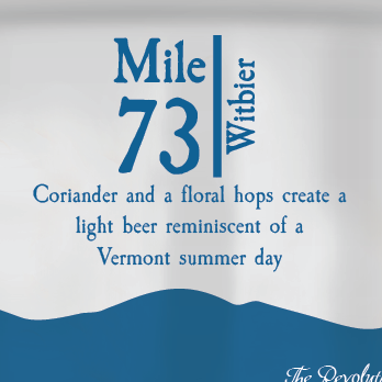
First up – the Bayley Hazen flagship beer, Mile 73. This is a slightly cloudy witbier with hints of coriander and orange. Brewed with floral hops, Mile 73 is the perfect refreshing beer for a hot summer day.
Front
Back
Story
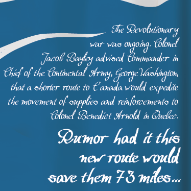
All Bayley Hazen beers are named after historical facts and/or legends, and Mile 73 is commemorative of the 73 miles that the Bayley Hazen road was going to save the Continental Army in their travels to Quebec during the Revolutionary War. I chose this beer as the flagship beer because it is directly related to the reason that the Bayley Hazen road ever came to be.

I decided that the artwork concept would be a road and mountains – same as the logo, but with a spin. Footprints are shown on the road, wrapping around the can and guiding the viewer to the story on the back. All fun and interesting copy corresponds with that of the logo. All mandatory copy (Fl. Oz., Please Recycle, etc.) is in a sans-serif font. The art is clean and simple while still maintaining character, and works with the logo to form a cohesive whole as a packaged product.
I’ve been seeing a lot of craft canned beers with a type of clear plastic label that utilizes white space, allowing the can to shine through as a part of the design. I think this look is super fun! I decided to use that concept for my packaging. The road and the “Mile 73” on the front are both clear, showing through to the can beneath.
I’ve been seeing a lot of craft canned beers with a type of clear plastic label that utilizes white space, allowing the can to shine through as a part of the design. I think this look is super fun! I decided to use that concept for my packaging. The road and the “Mile 73” on the front are both clear, showing through to the can beneath.
Bayley Hazen Brewing Co. - Logo Design
1/14/2020
I’m back to my cozy Buffalo apartment after spending the holidays with family in Vermont. One of my favorite things about both Buffalo and the NEK is the plethora of craft brewing companies. Craft beer packaging offers a vehicle for some awesome art and design. During my holiday travels, the Bayley Hazen road, a historical military road built during the Revolutionary War, inspired an idea for a craft brewing company of the same name.
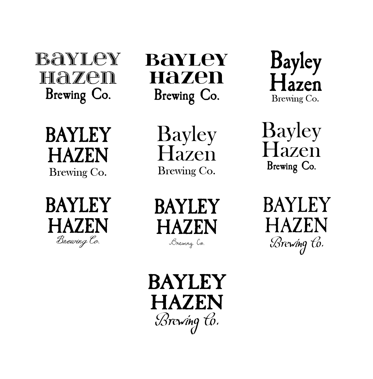
I wanted the logo to reflect the history of its namesake, so I started out with fonts that evoke the colonial era. I settled on Caslon Antique, the most classic of colonial era fonts. I felt that with the right design, this font would create a logo that feels both original and familiar to the viewer. The script I incorporated for “Brewing Co.” looks like it might have been scrawled using a quill pen by the light of a flickering candle as the British approach.
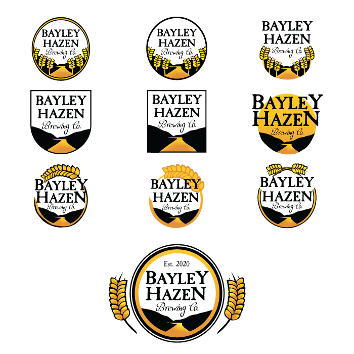
I knew that I wanted both a road (for obvious reasons) and wheat in the graphic for this logo. Wheat is the plant of choice for this logo, rather than hops, because the brewery specializes in Witbiers and Hefeweizens. Wheat was also grown in Vermont shortly after the Revolutionary war, another historical tie-in for the logo.
I worked through several layouts before finally settling on a circular one. The slant of the mountains draws the eye in, to the road. The flow of the road into the yellow band unifies graphic and text. Two circular bands outside of this add texture, and provide a smooth transition to the wheat graphics.
I worked through several layouts before finally settling on a circular one. The slant of the mountains draws the eye in, to the road. The flow of the road into the yellow band unifies graphic and text. Two circular bands outside of this add texture, and provide a smooth transition to the wheat graphics.
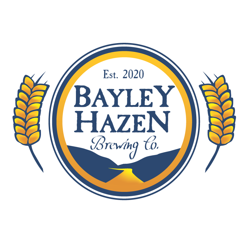
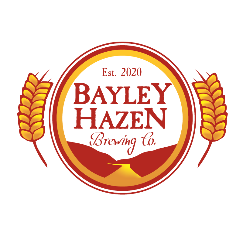
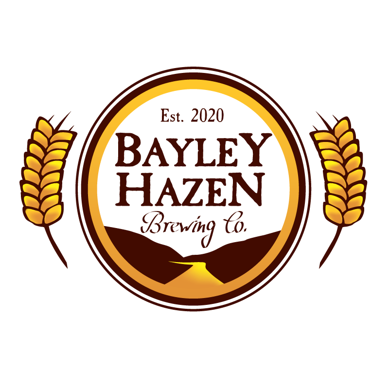
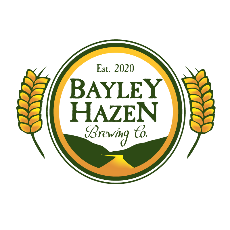
Now it was time to play with color. I chose brown, green, blue, and red, which all work with the golden-yellow of the road and wheat. These color variations on the logo can be used for different beers. I plan on designing the packaging for Bayley Hazen Brewing Co. beers as my next project. Stay tuned!
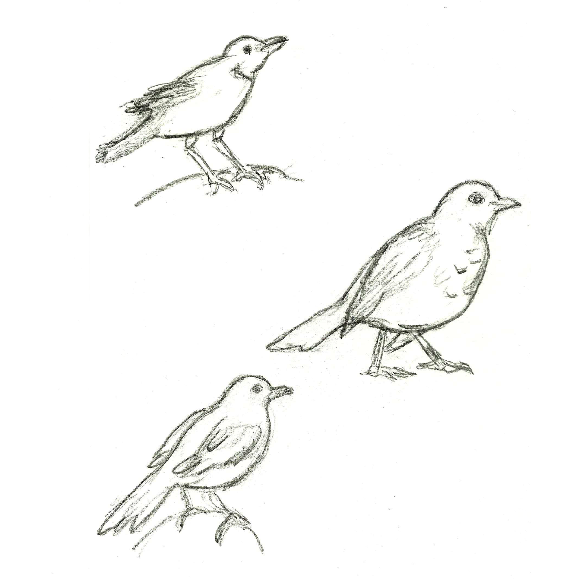
Blackbird Floral Design - Logo Design
12/11/2019
We’re now solidly into the winter/holiday season, but a few weeks ago I was already starting to miss green grass and sunshine. The concept for Blackbird Floral Designs came to me while thinking about summertime and gardening.
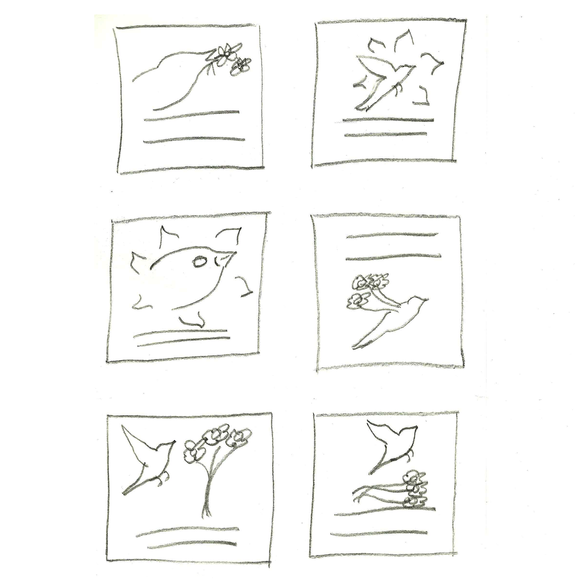
Thumbnails
Sketches
I wanted to design a logo for a conceptual floral design business that specializes in using organically grown flowers, with a focus on herbal arrangements. I’ve always had an interest in herbalism, and I think it’s especially fun when a floral arrangement is not only beautiful, but has other uses as well. Keeping everything organic is good for everyone all around. I think this would be a really fun business model!
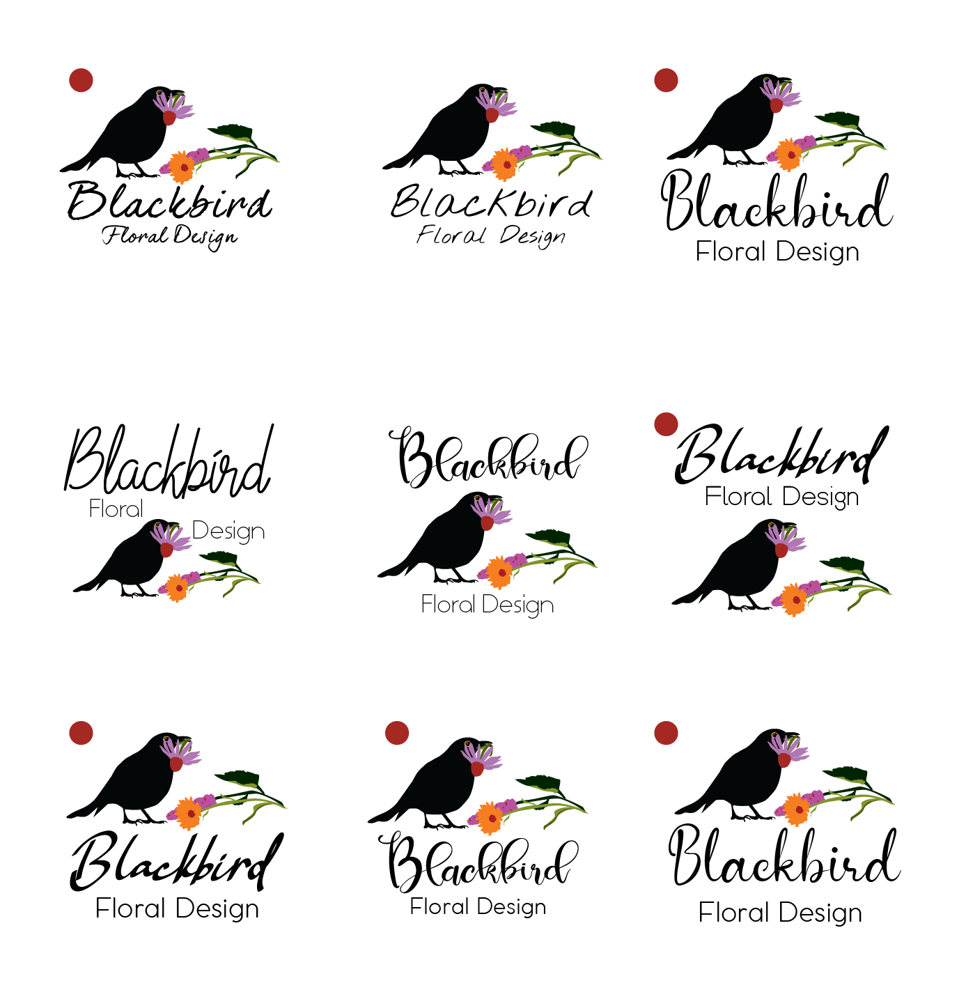
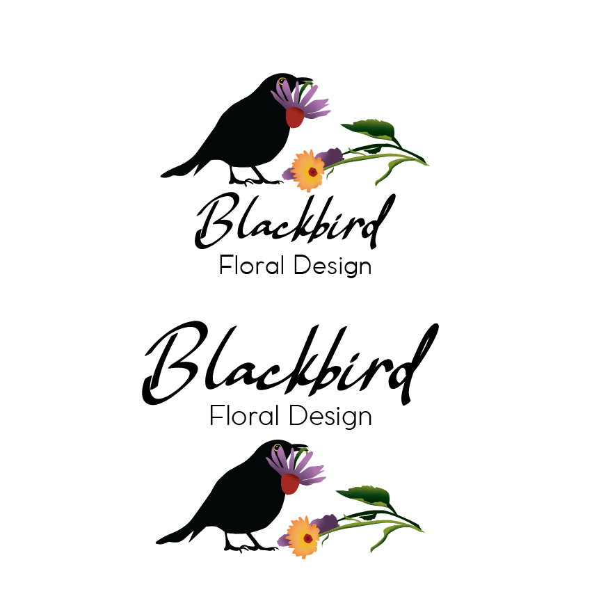
My thumbnails had some interesting layout ideas, and ultimately I decided that I wanted the bird to be standing on the ground, building a bouquet out of Echinacea, calendula, and anise hyssop flowers. I grew these herbs in my own garden in years past, and the combination of the three always made an especially beautiful, long-lasting bouquet. The calendula also ties in nicely with one of the blackbird’s most defining features, the yellowy orange circle around their eyes. To enhance this, I kept the silhouette of the bird black, with no orange on the beak, so that the eye stands out.
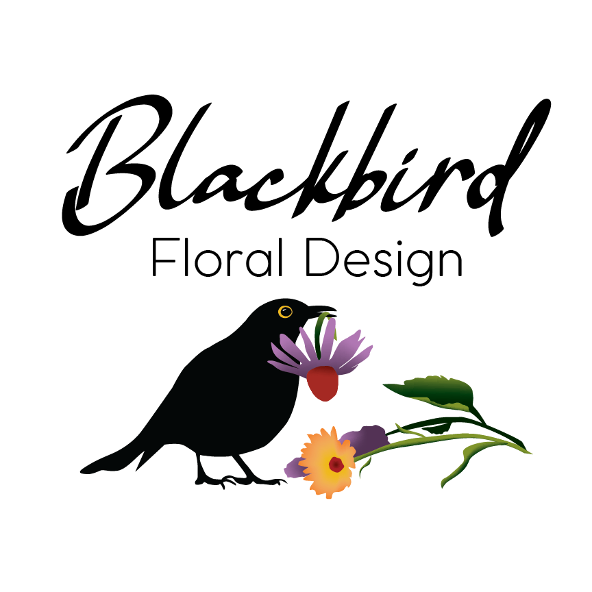
For typography, I chose a script typeface that has an open, happy feel, and a sans-serif typeface that has a bit of character without competing with the script. The weight of the script balances the graphic, and feels like an echo of the silhouette of the blackbird. I hope this brings a bit of spring to anyone checking this post out - we'll get there, eventually!
Billie Eilish - Conceptual Concert Poster
12/6/2019
Moving to a new State presents a lot of logistical maneuvering – updating your license, signing up with an electric company, having Wi-Fi installed in your new apartment. Also, more importantly, what radio station are you going to listen to now? When I lived in Vermont, I switched exclusively between The Point Independent Radio Station and Vermont Public Radio. Now, after moving to Buffalo, NY in August, hitting station buttons 1 and 2 on my car dashboard resulted in a depressing static.
It took a bit of surfing, but I finally found my Buffalo radio stations, Alternative Buffalo and WBFO, Buffalo’s NPR News Station. Buttons 1 and 2 were reprogrammed and back in business. Lana Del Rey’s “Doin Time” was an August and September fave on Alternative Buffalo. And then there was Billie Eilish’s “Strange Addiction”, which wrapped its fingers around my little millennial heart with its sultry beat paired with clips from The Office.
Billie Eilish’s 2020 tour doesn’t include Buffalo, so why not scheme up a conceptual 2021 concert at Canalside Buffalo? I wanted to design a poster that was location specific. I did a little research and discovered South Bay Bessie, the legendary Lake Erie lake monster. After some sketching, I had an illustration that I liked.

I then moved to Illustrator to refine the illustration. I felt the poster should be vaguely disturbing and tie in with Eilish’s signature black and green color scheme. After experimenting with a few color schemes, just because these vibrant colors were too fun to not experiment with a bit, I achieved this by using only black and green, with one pop of white in Eilish’s eyes, which ties in with her “When We All Fall Asleep, Where Do We Go?” album art.
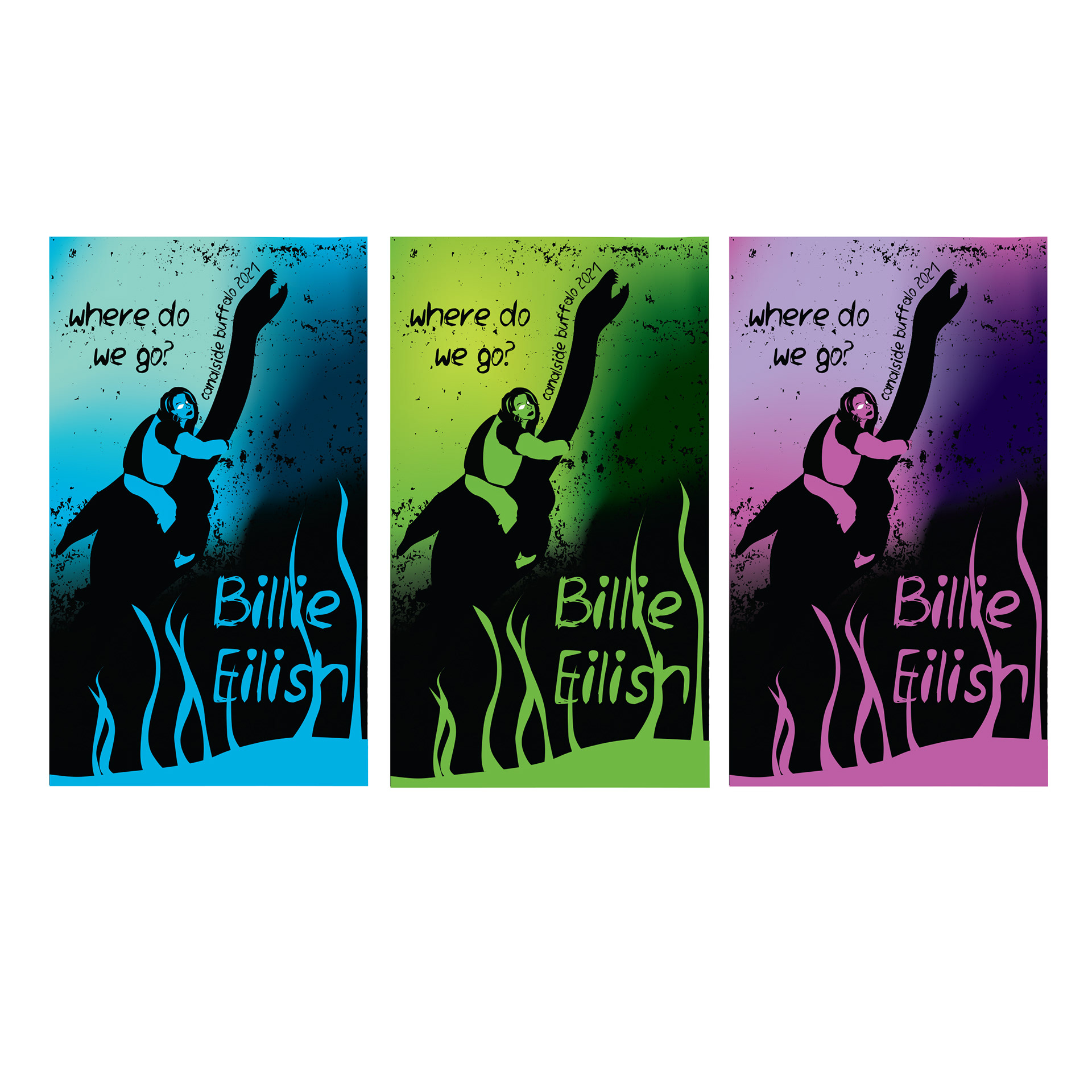
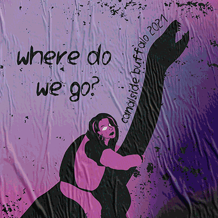
I completed the poster with grunge text, including concert title, location, and artist name. The location snakes along South Bay Bessie’s neck, and the artist name blends with the seaweed, unifying text and art.
Like Old - Logo Design
12/5/2019
I had just finished a week-long, self-inflicted, sketch-a-day challenge. The right side of my brain was awake and ready for action – what now? Back home in VT, family news included that a classic car was being worked on to be made ready for a winter tuck-in, i.e. storage. Classic cars are fun to draw… and retro fonts, what fun! “Like Old” was born.
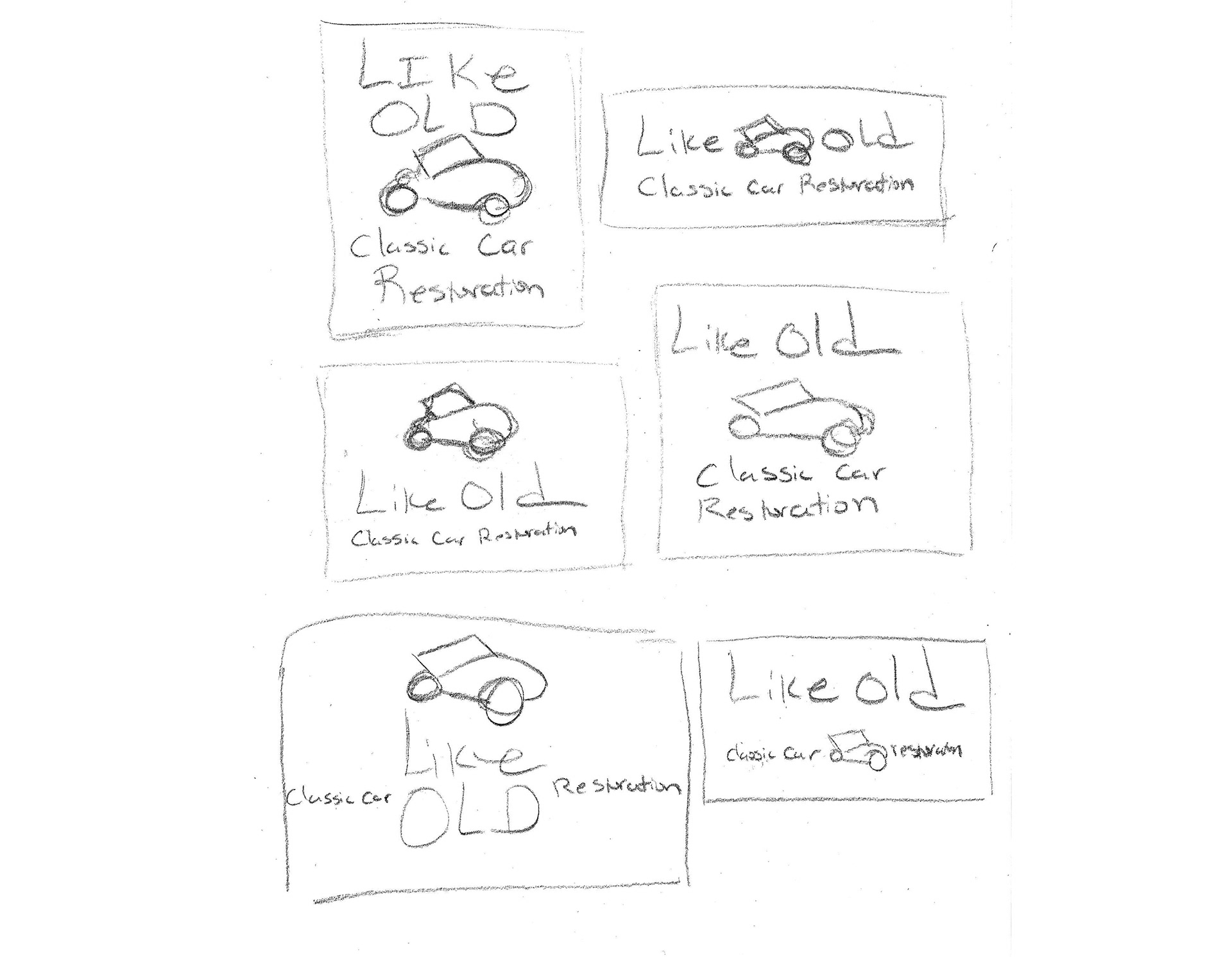
Thumbnails
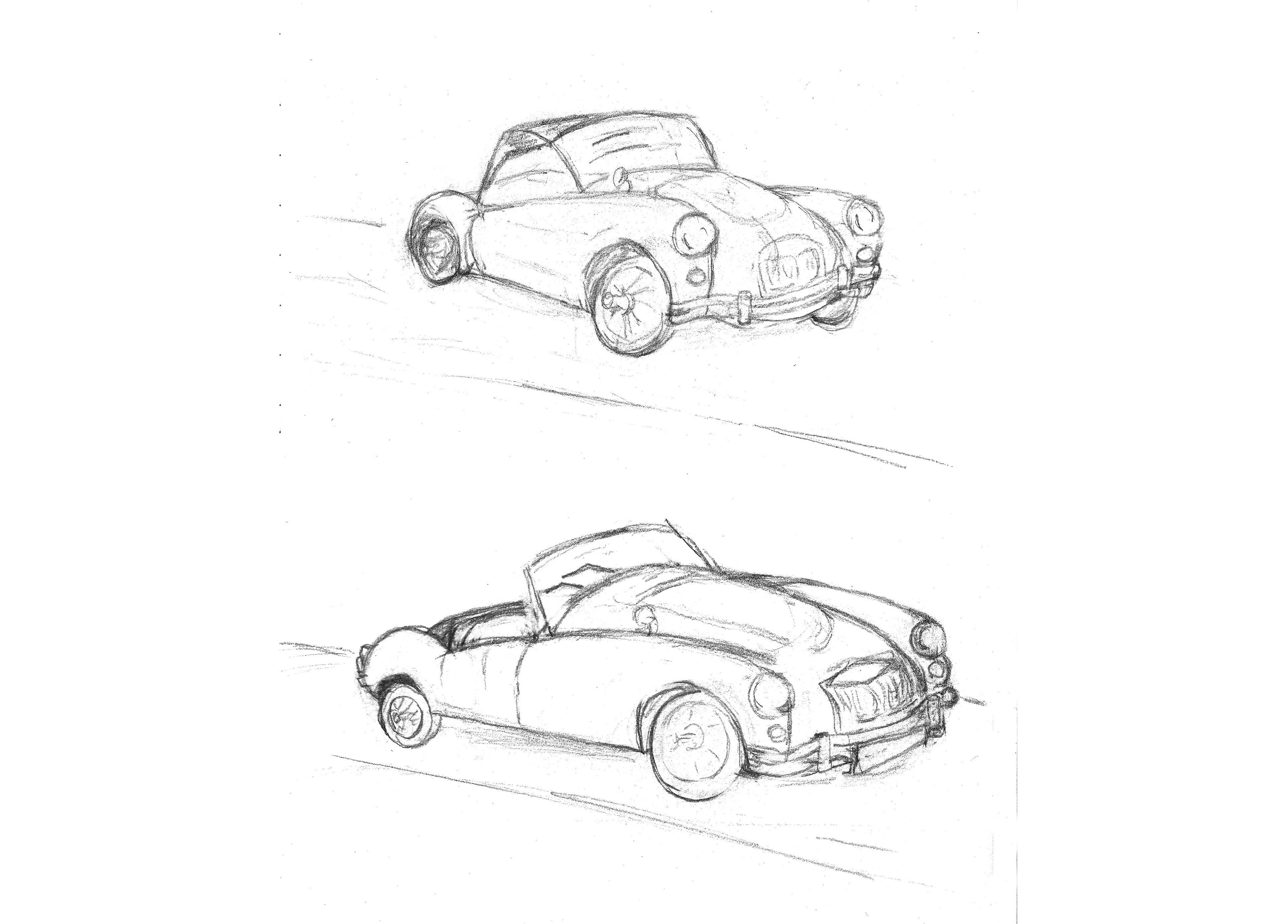
Sketches
Well, the idea, anyway. Some time was spent googling classic car images. A little more time was spent sketching.

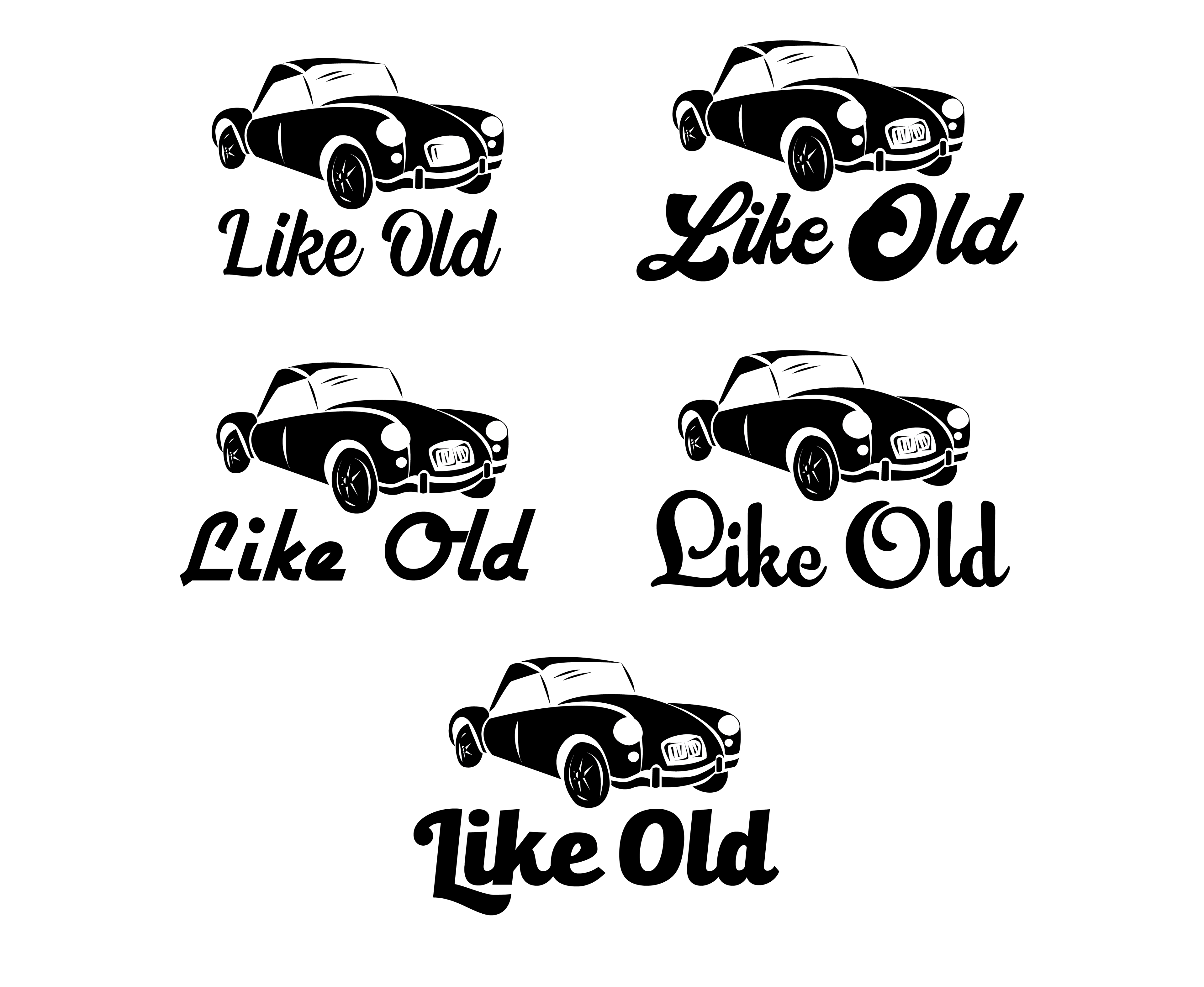
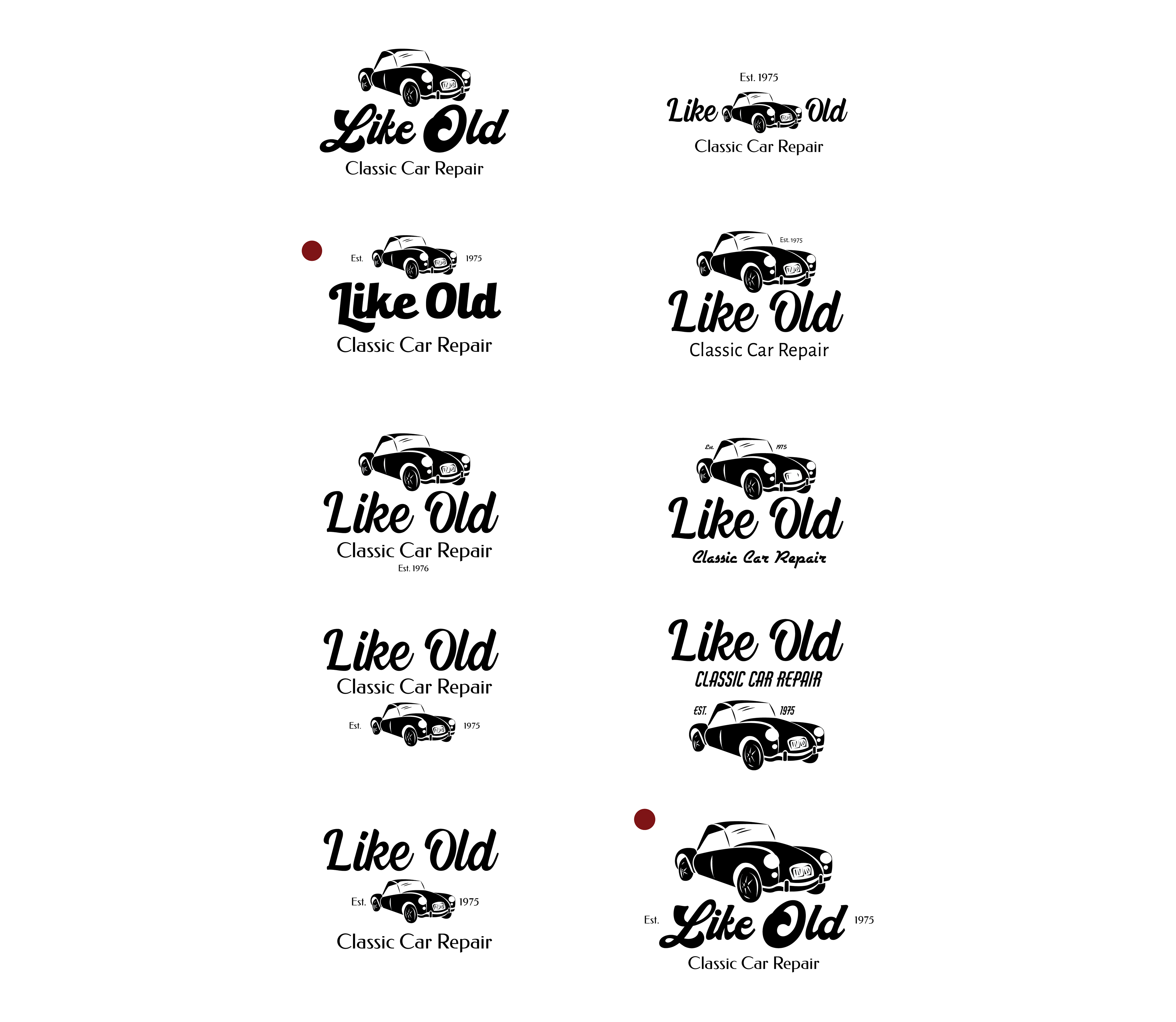
Once I reached the point to start creating a vector, I worked in black to let the form of the design, fonts, and layout stand out without distraction until I was satisfied with what I had.
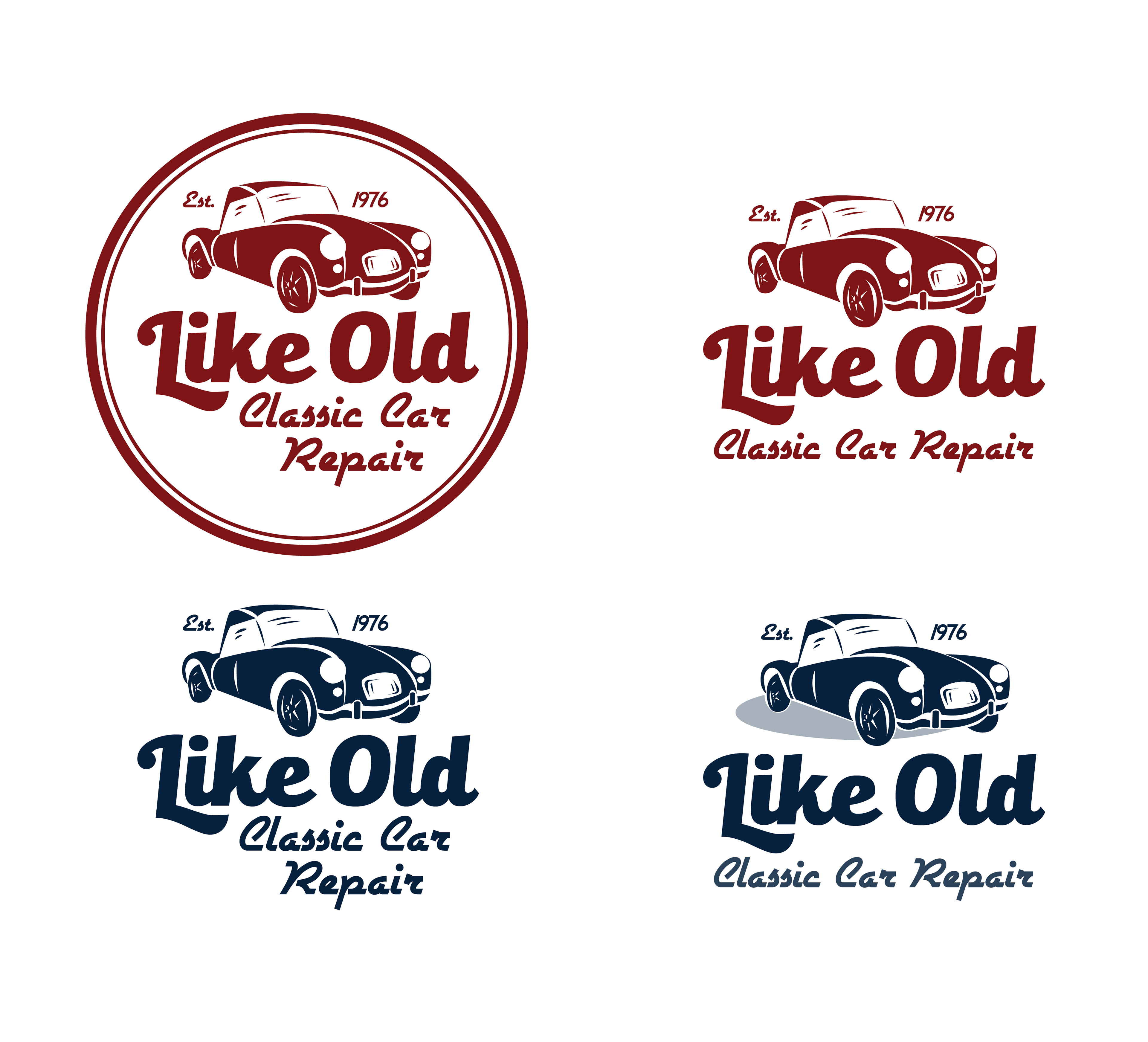
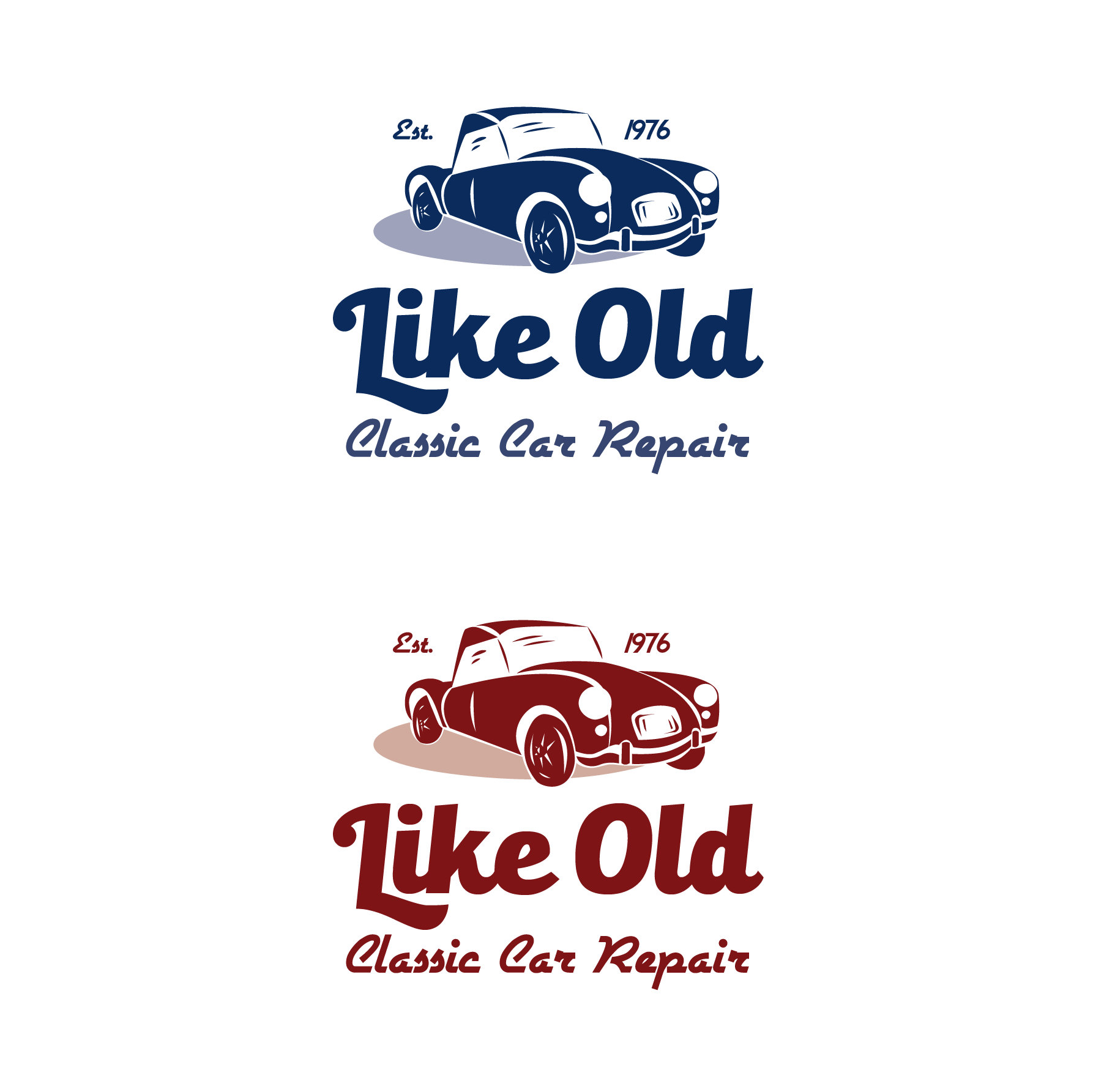
For color, blue stood out in my mind as the best choice for the logo, honestly because no other color really worked for me. Pink or orange? Yikes. Green? It’s a car repair shop, not a greenhouse. Yellow? Too light. Purple? Don’t get me wrong, I love purple, but not here. Blue is quiet but subtly fun when combined with the vintage-style design. I played around with a maroon a bit as well, which also worked, but blue was the clear winner.

And here we are, final product! Now I want a classic car…