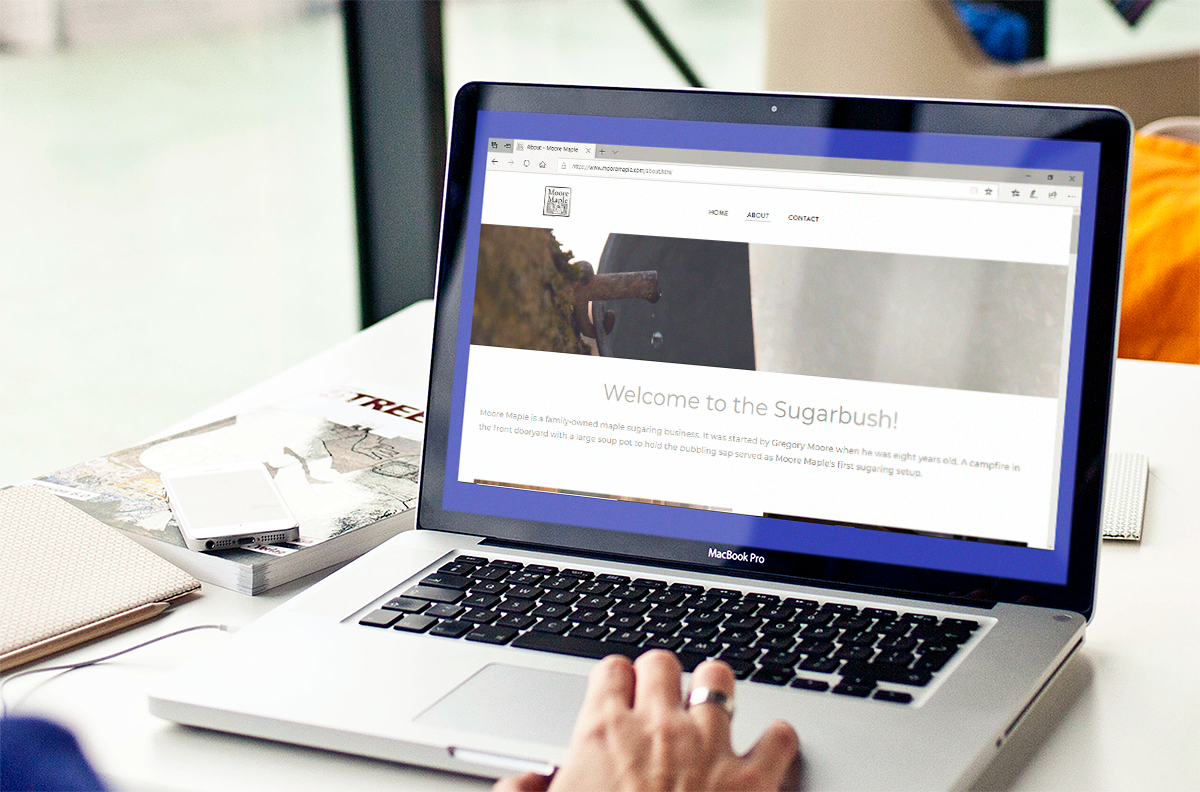
A Vermont maple sugaring operation, Moore Maple was started by Gregory Moore when he was eight years old. His first sugaring setup was a campfire in the front dooryard with a large soup pot to hold the bubbling sap. He's been sugaring for 13 years now.
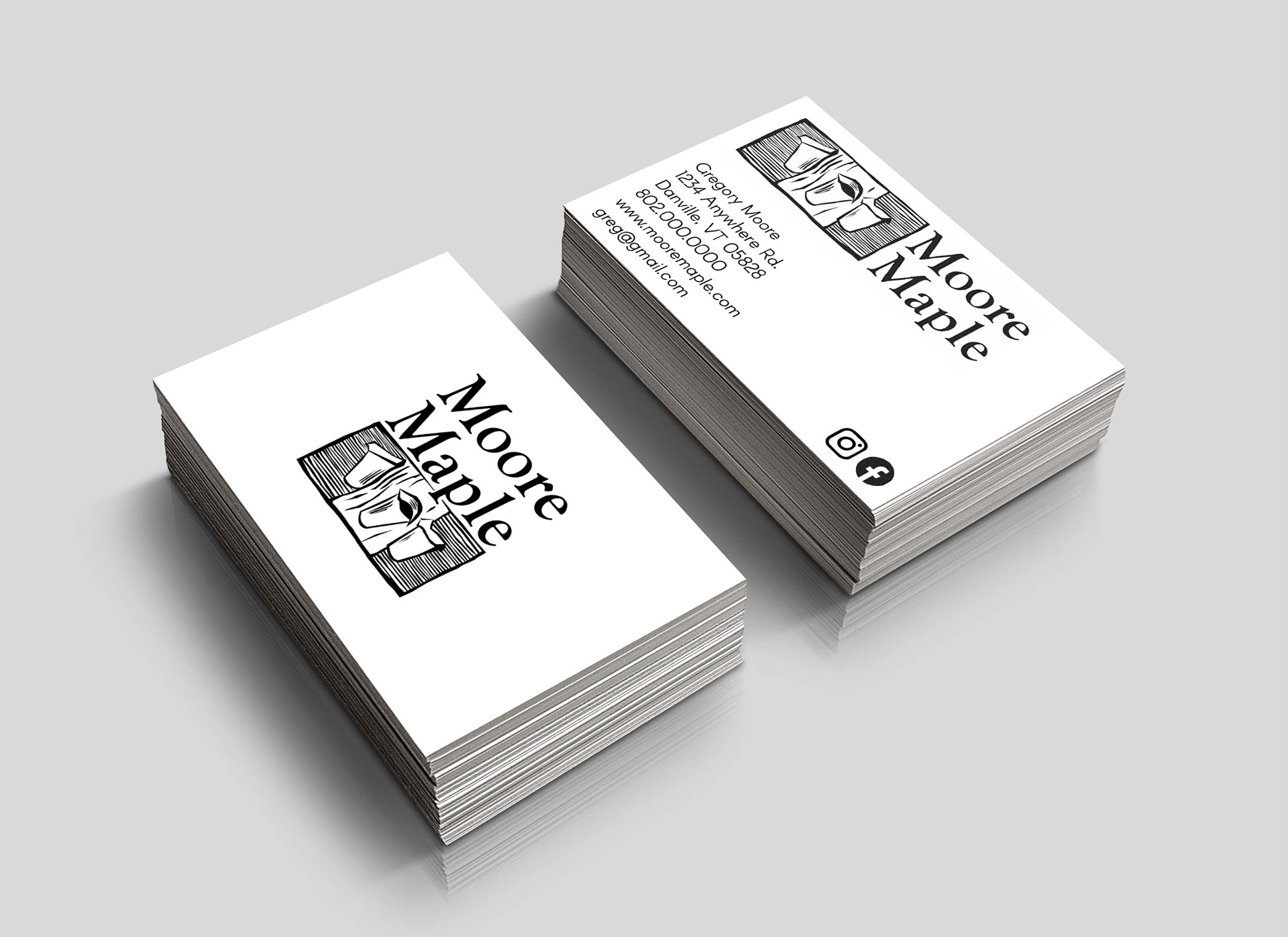
When it was time for me to do my college senior project, it made sense to design a brand identity for Moore Maple. Greg wanted a modern logo with a traditional feel that could be used for business cards and on a website.
When it was time for me to do my college senior project, it made sense to design a brand identity for Moore Maple. Greg wanted a modern logo with a traditional feel that could be used for business cards and on a website.
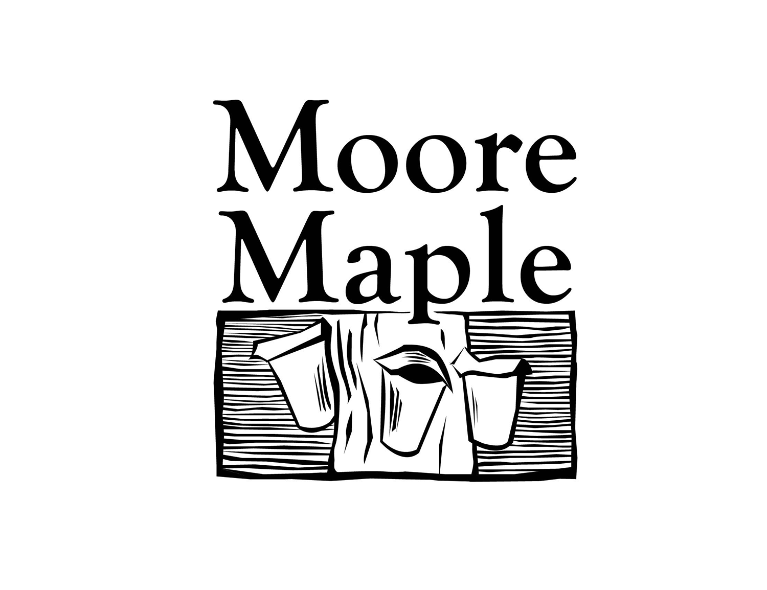
The logo is designed in the style of a woodcut, to convey the old-timey,
back-to-the-land vibe of Vermont maple sugaring.
I gave Greg the choice of the logo with or without textured lines in the background, and he chose the former.
back-to-the-land vibe of Vermont maple sugaring.
I gave Greg the choice of the logo with or without textured lines in the background, and he chose the former.
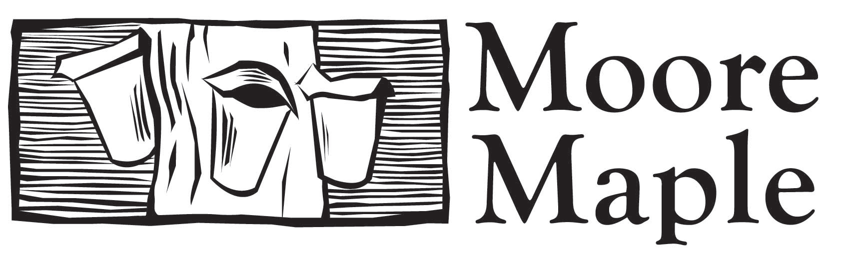
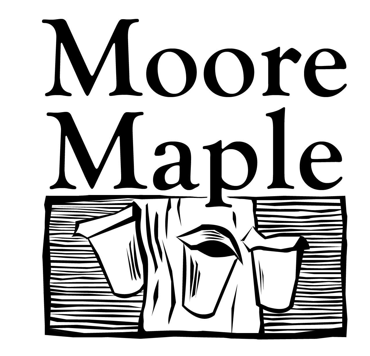
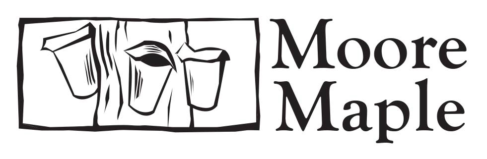
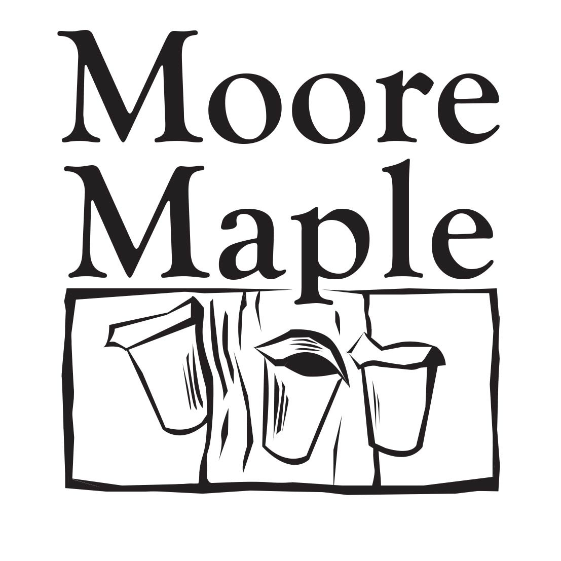
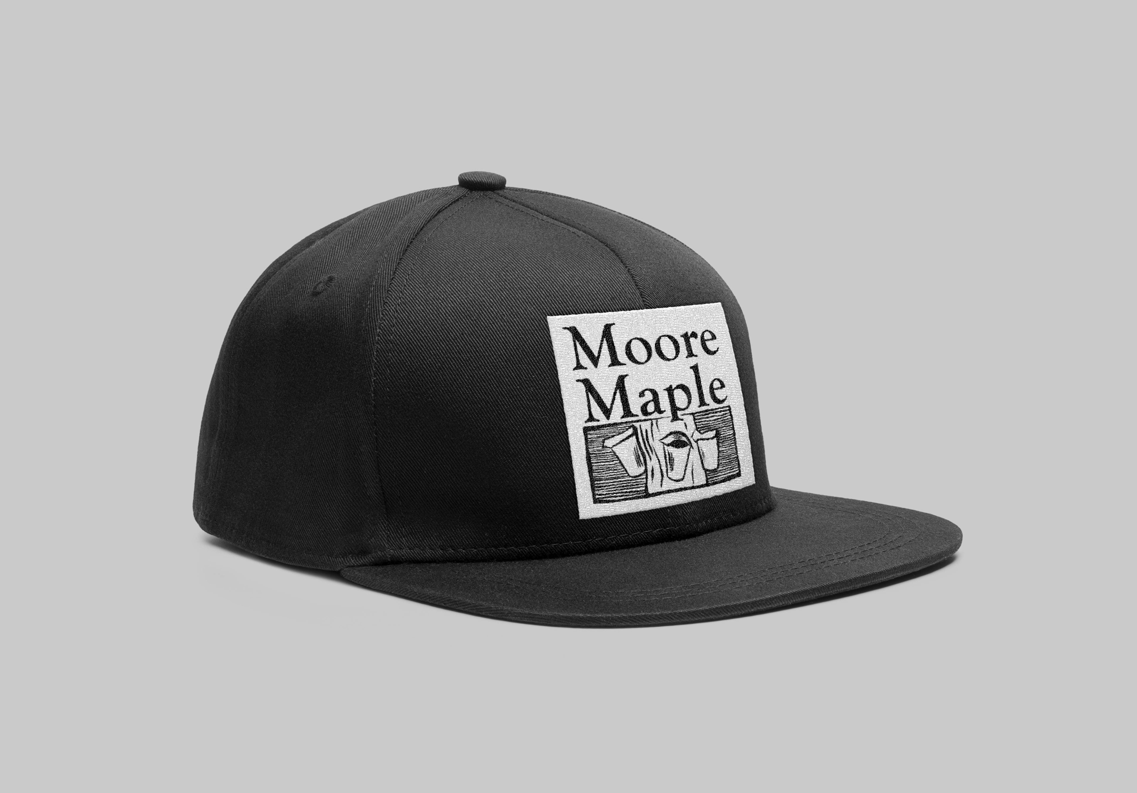
The logo can be used in either a vertical or a horizontal format, which is useful in different branding collateral products.
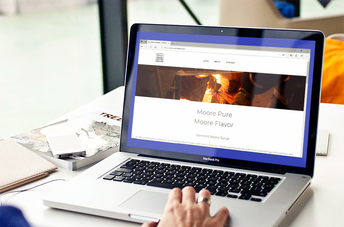
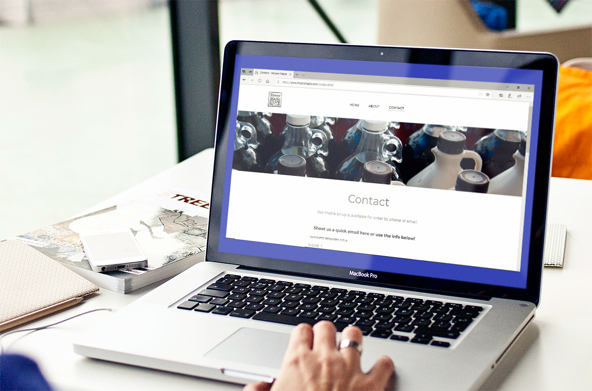
I also designed a website for Moore Maple. You can view the live site here