
This company caters to classic car enthusiasts. The logo needed to convey reliability, and that this is a competent company you can trust to do your car repair work. It also needed to show a fun side, and evoke a bit of nostalgia. Classic cars are a hobby, and more than just a means of transportation.
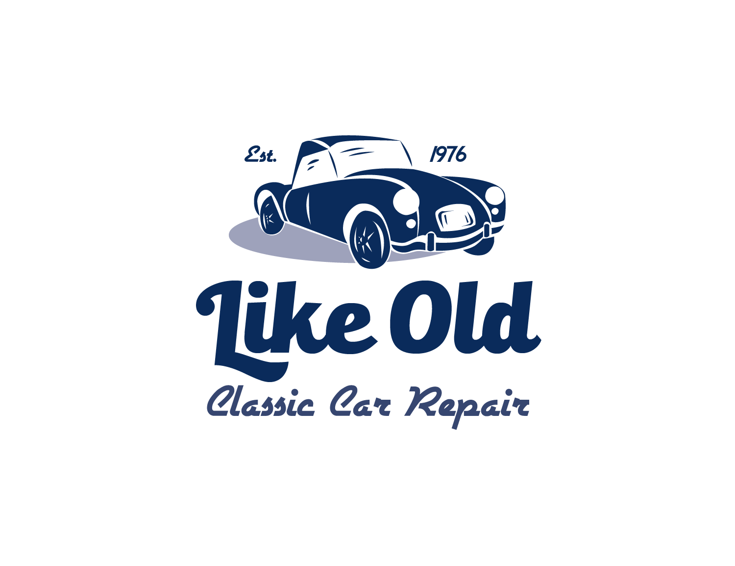
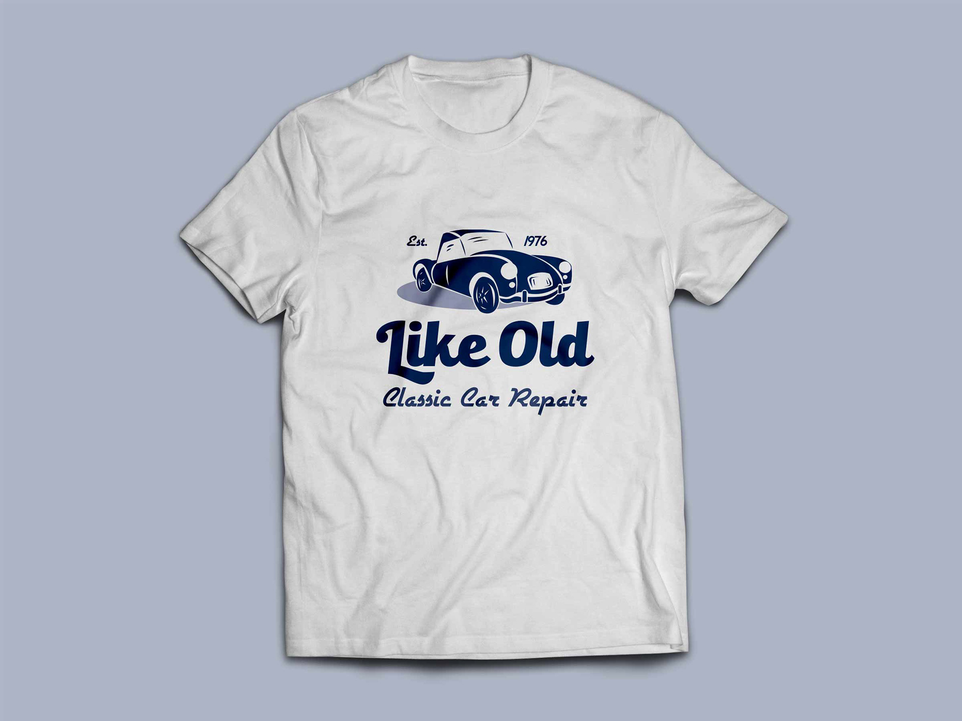
I created a logo in a vintage style delivered with a modern feel. The clean illustration of a 1960s car strikes a fun balance between whimsical and realistic. Two complimentary, retro typefaces are used to reinforce the overall feeling that this logo could have been taken out of the time period it represents. The navy blue color adds fun to the design, while still being a subdued color, conveying reliability.
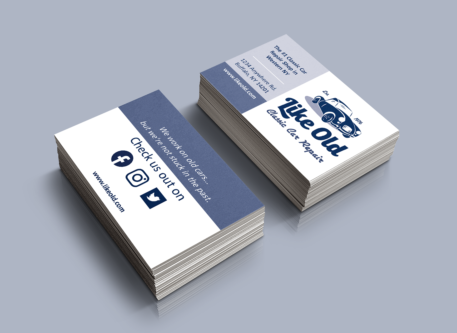

Print collateral for this brand uses a sans serif font with a bit of character to keep the design clean. Copy is simple and relatable. The overall result is professional and fun.