Upper Valley Press, North Haverhill, NH
As the in-house direct mail advertising designer at Upper Valley Press I worked both from existing templates and templates that I created after discussing design specs with prepress.
Hubert's
West Lebanon, NH
West Lebanon, NH
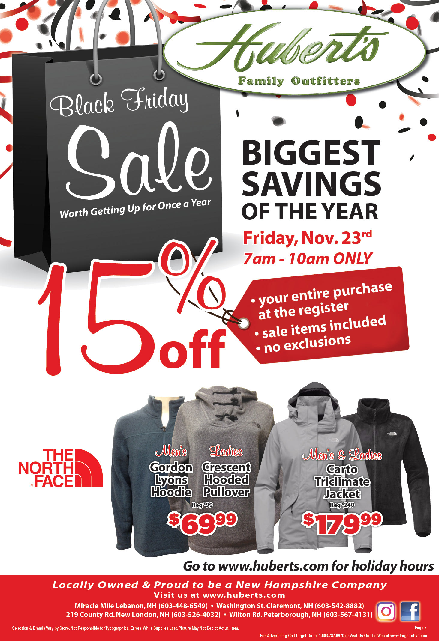
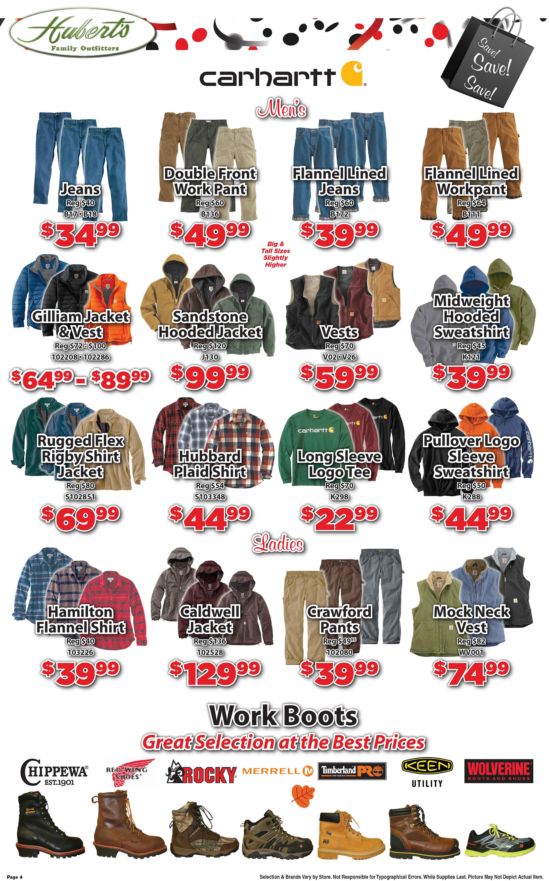
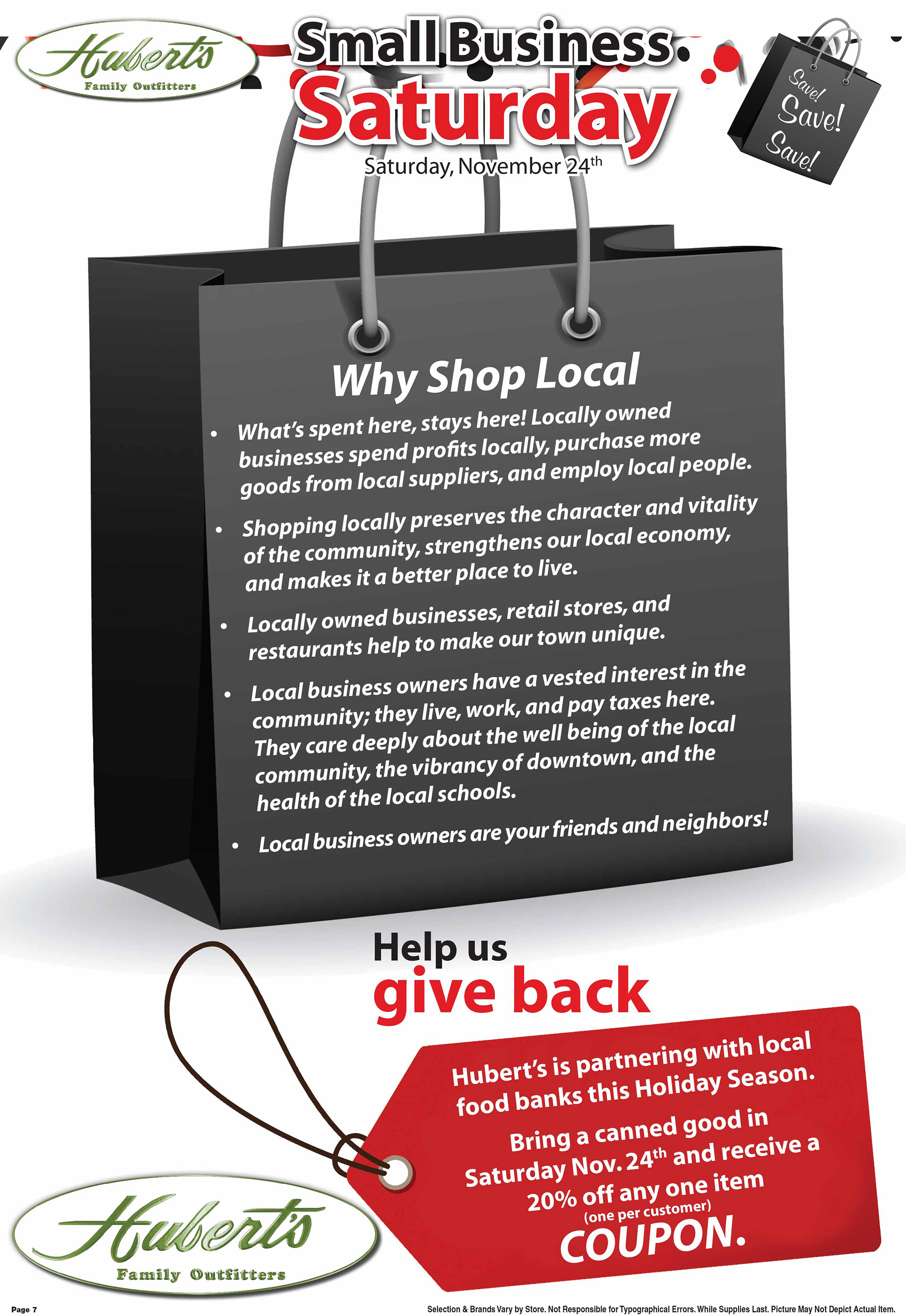
Hubert's Black Friday Sale featured a black and red color scheme. The black bag graphic added interest to the layout, while also being a space for relevant text.
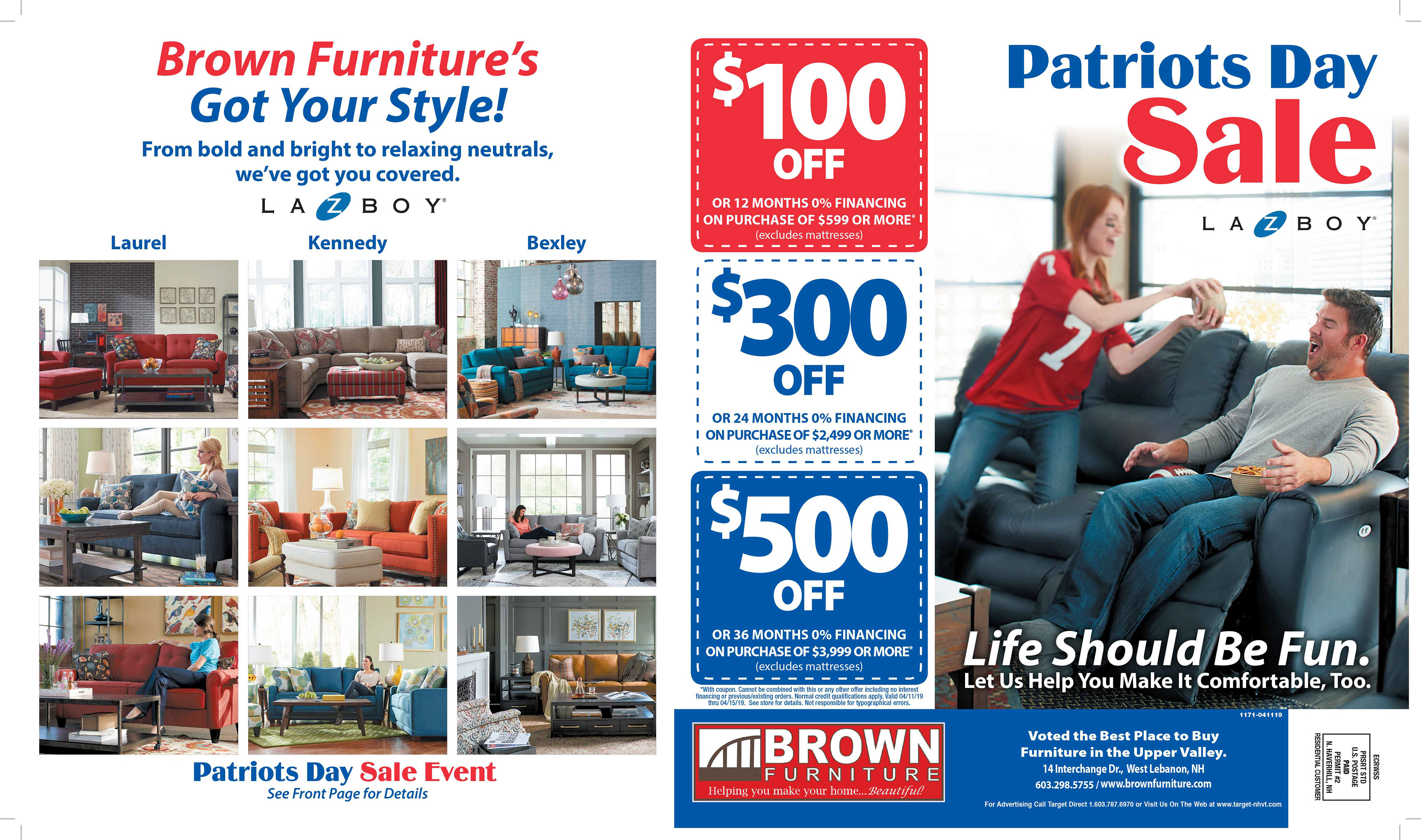
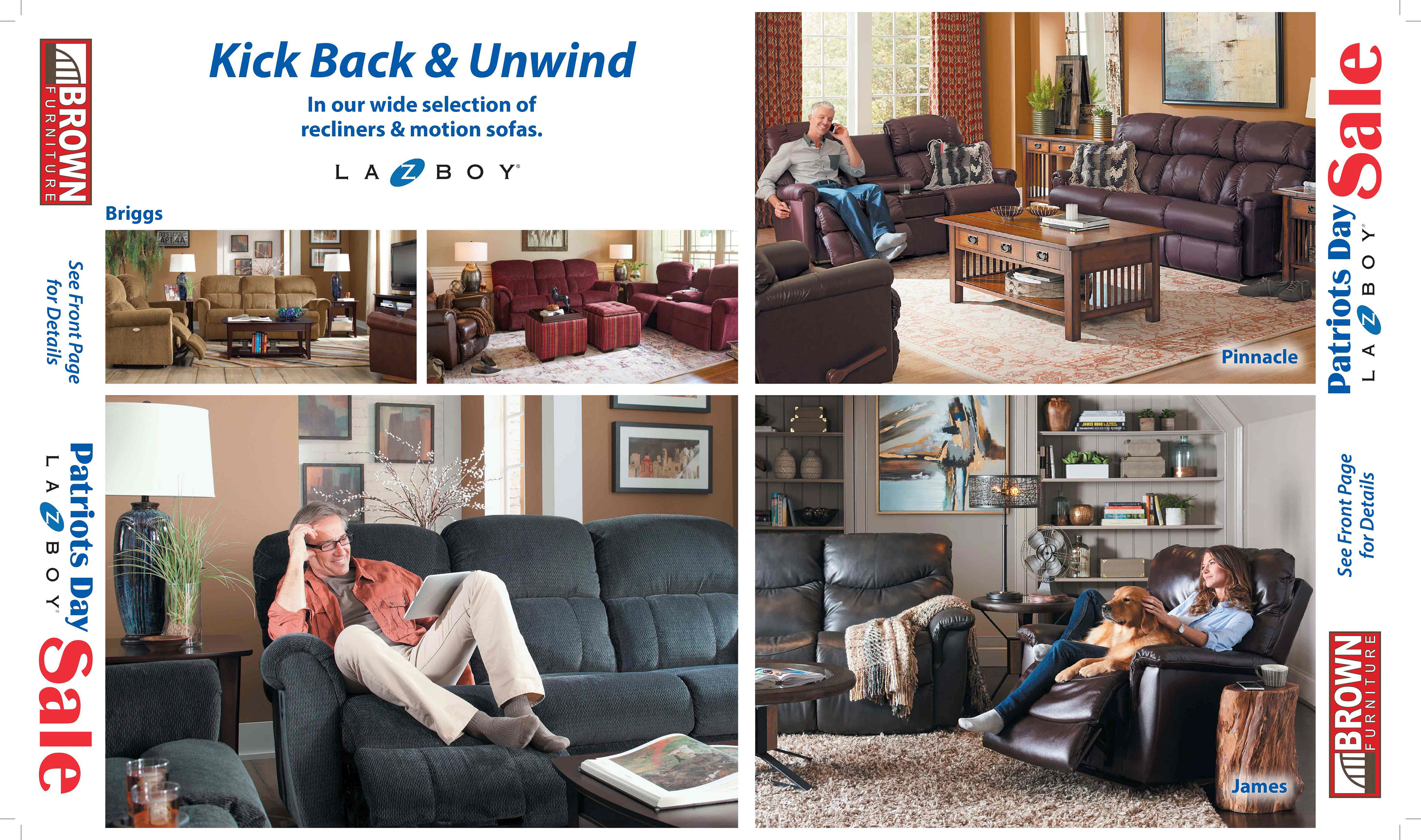
Brown Furniture - Patriot's Day Sale
West Lebanon, NH
West Lebanon, NH
I collaborated with the owner of Brown Furniture to create the copy for each section of this flyer. "Life Should Be Fun", "Kick Back and Unwind", and "Brown Furniture's Got Your Style" all came together to accent how family life revolves around the spaces where we relax.
We decided to use a red, white, and blue color scheme for this patriotic holiday, and to keep the layout simple and bold. A grid structure is used, and a sans serif font for all but the sale heading. This is a photo-heavy flyer, visually emphasizing how beautiful your home could look with this furniture.
We decided to use a red, white, and blue color scheme for this patriotic holiday, and to keep the layout simple and bold. A grid structure is used, and a sans serif font for all but the sale heading. This is a photo-heavy flyer, visually emphasizing how beautiful your home could look with this furniture.
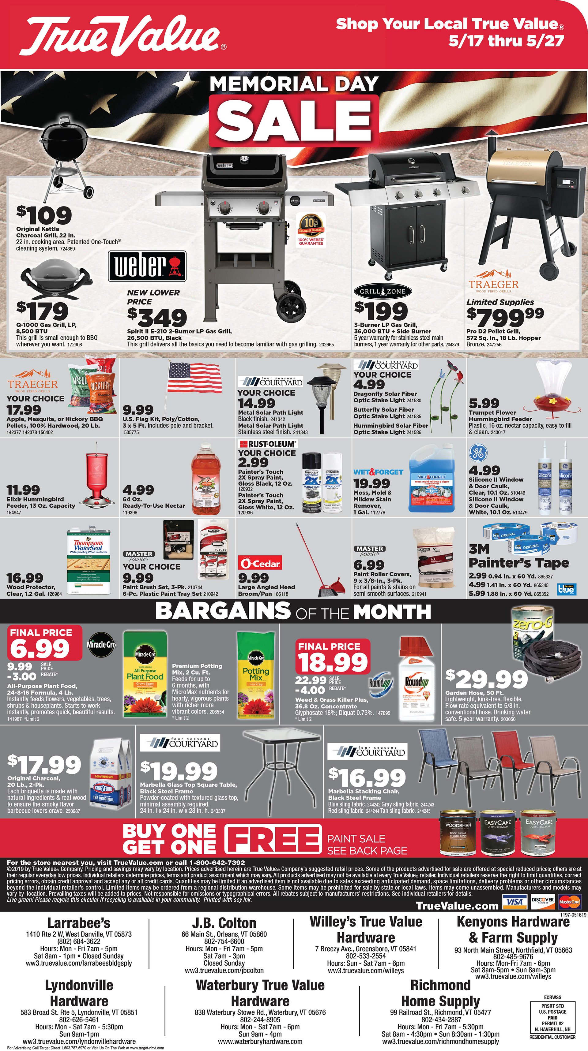
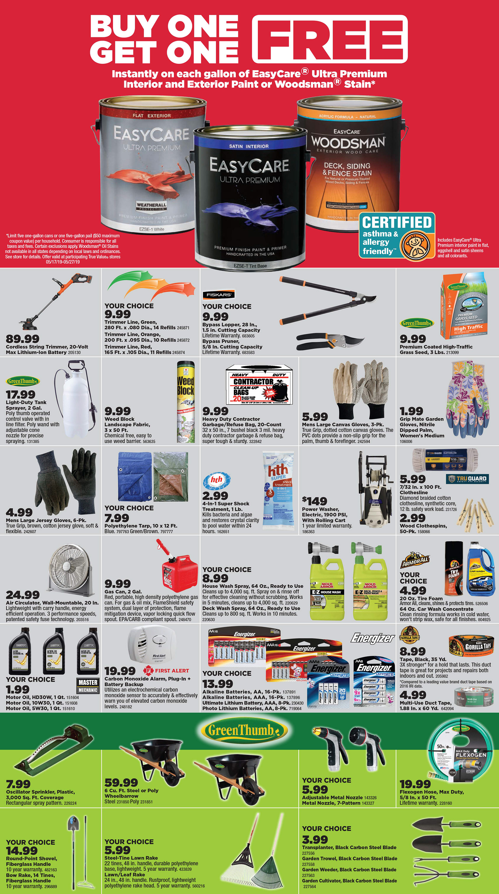
Lyndonville Hardware - Memorial Day Sale
Lyndonville, VT
Lyndonville, VT
This flyer was created using True Value approved fonts and brand guidelines. A grid structure was used in the design. Font sizes were specifically chosen for each section of the flyer, so that details could be as small as possible while still printing clearly, and prices are large enough to knock-out for a bolder black print. I pathed and image corrected many of these images, and edited the copy provided by True Value to fit into our limited space while still providing pertinent information.
