Target Direct
Upper Valley Press, North Haverhill, NH
Upper Valley Press, North Haverhill, NH
Space was a challenge when creating these 8.5" x 5" cards. All cards had to up to print specifications, and
I often had to work with client-provided files that were low resolution. I was working with many different businesses, and each individual card had to stay on brand. Sometimes there were brand guidelines to follow, and sometimes I had to do a little research of my own to find out what look the company was interested in conveying.
I often had to work with client-provided files that were low resolution. I was working with many different businesses, and each individual card had to stay on brand. Sometimes there were brand guidelines to follow, and sometimes I had to do a little research of my own to find out what look the company was interested in conveying.

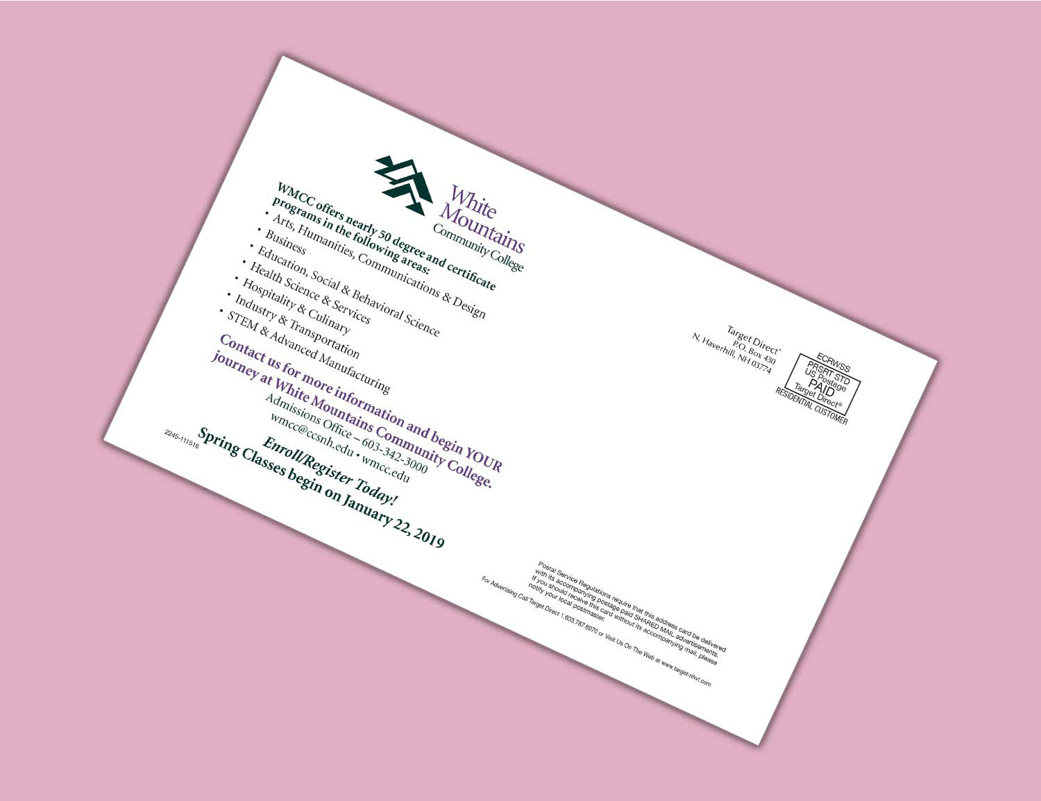
White Mountains Community College
New Hampshire
New Hampshire
After the client provided copy for this card, I did a little research and pulled the "one journey at a time" text from their website. I chose a stock photo of a diverse group of college-age students having a fun time to give the card a relatable feel, and used the logo font and colors for brand consistency.
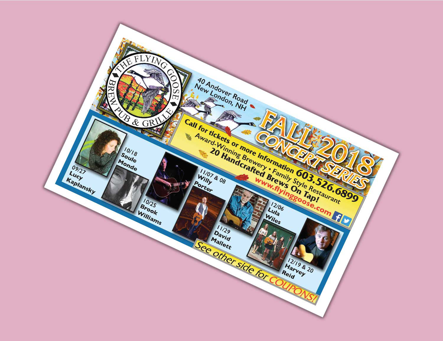
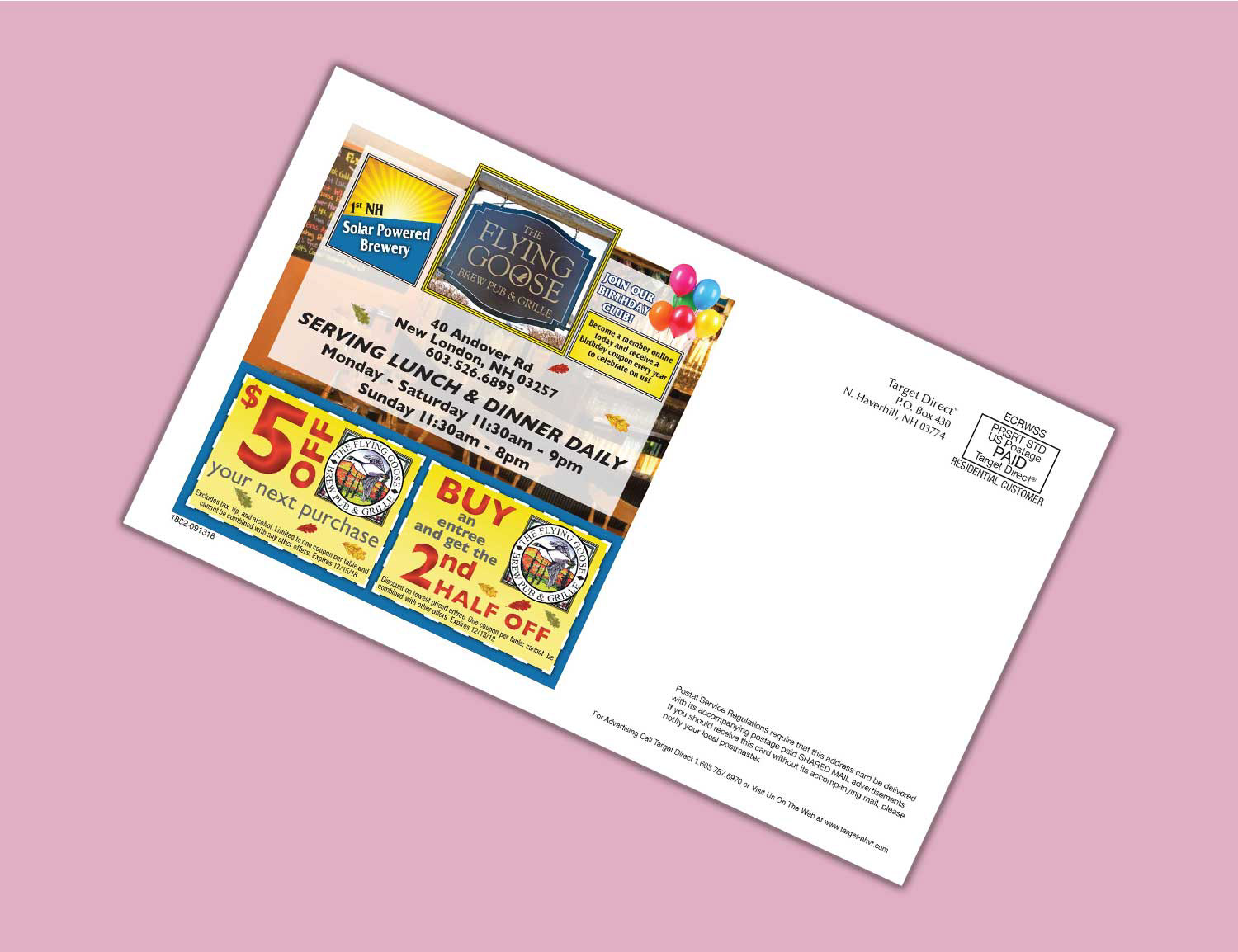
The Flying Goose - Fall Concert Series
New London, NH
New London, NH
After receiving copy, I found and manipulated stock art to create a hand-drawn background that matched the style of the logo. I then integrated the goose from the logo into the art. I went to the client's website and found a photo of their sign and the inside of their restaurant. I used these on the back of the card. I chose the logo blue and yellow as the main colors in the design because they contrast nicely and the yellow is in keeping with the fall concert series concept.
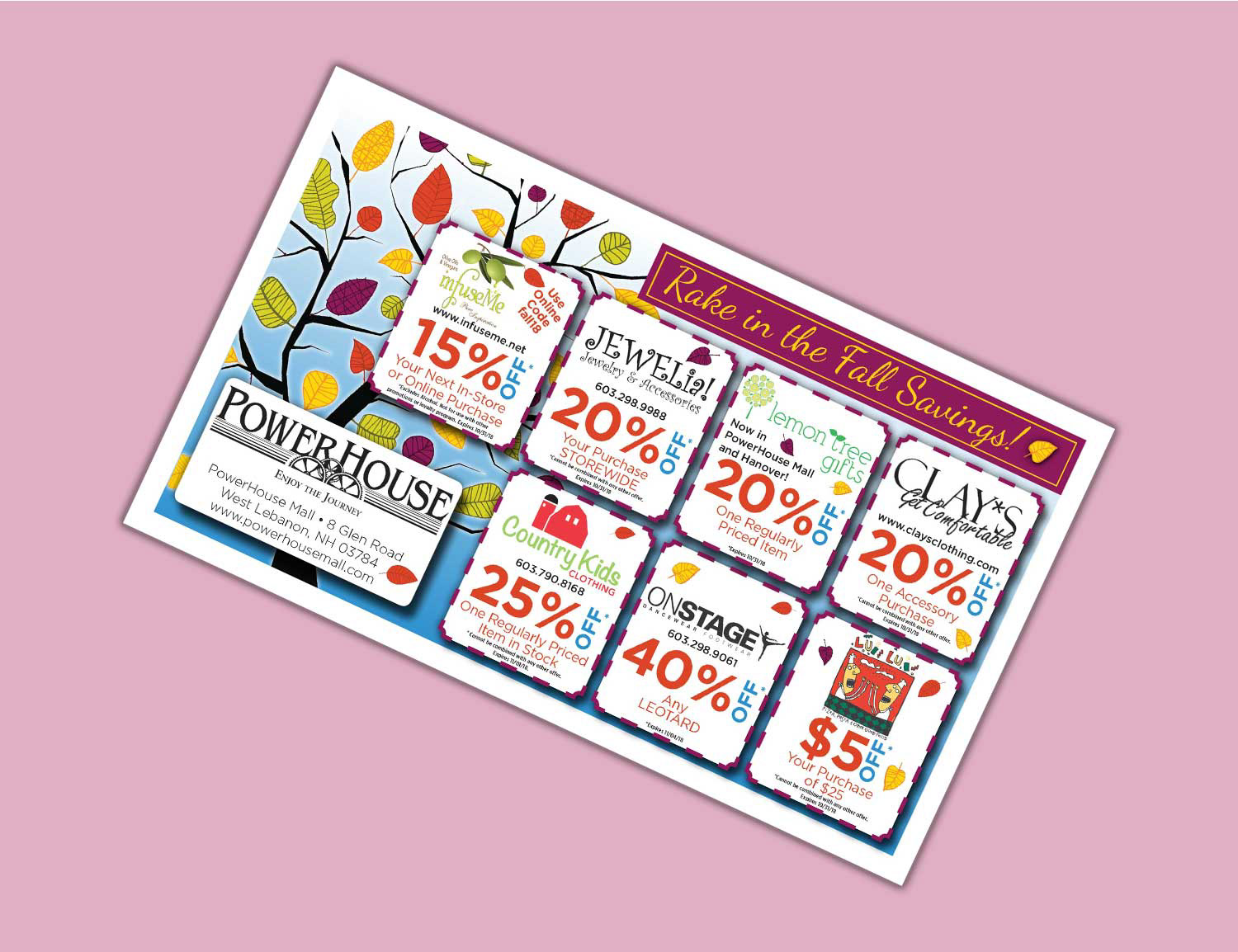
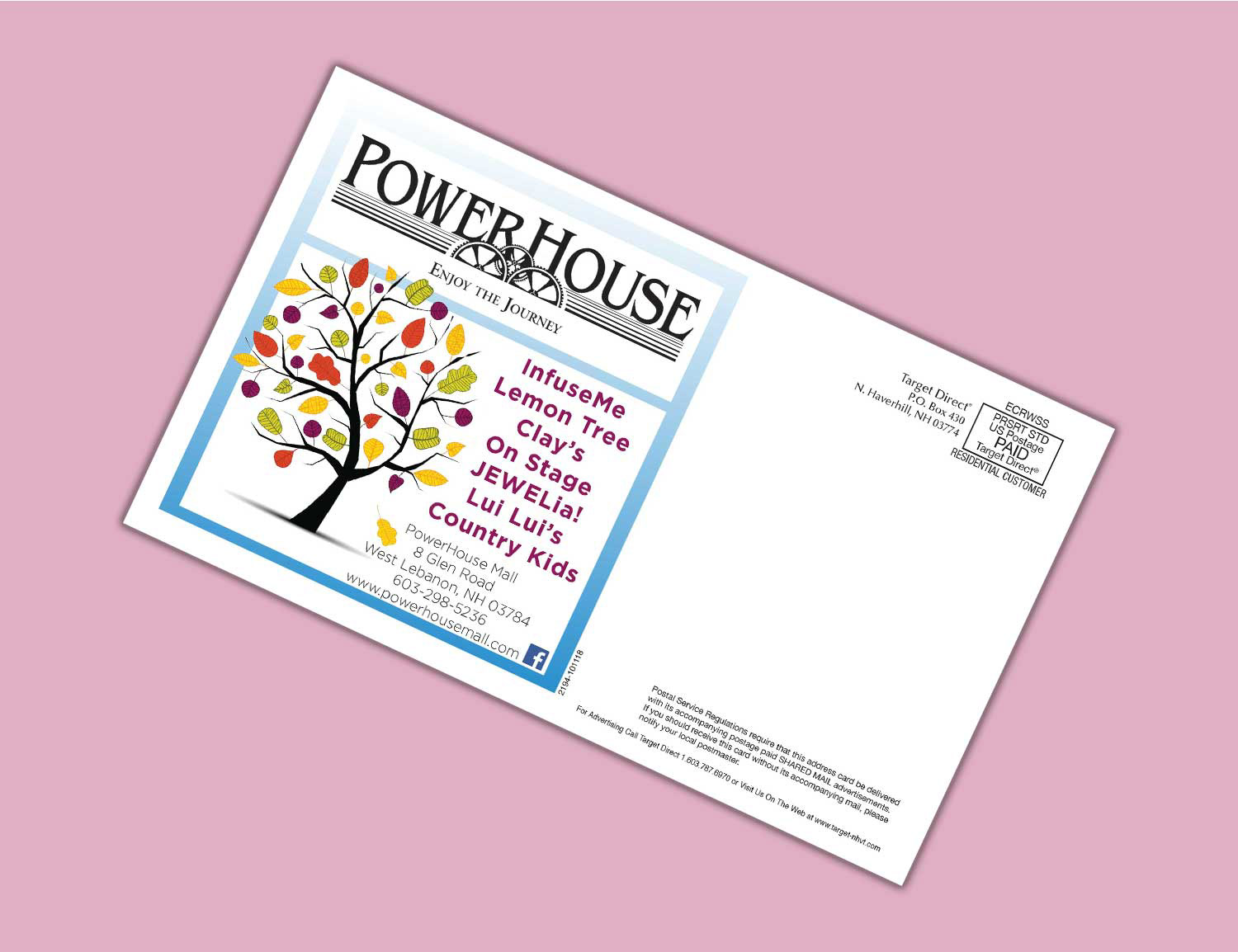
Powerhouse Mall
West Lebanon, NH
West Lebanon, NH
The Powerhouse Mall was having a Fall Savings promotion. I worked with all seven businesses who were a part of this to create a postcard. I used a playful tree graphic for the fall theme, and created coupons for each store using the same layout. The percentage off is the largest text, letting the audience know what the offer is at first glance. Store information is in smaller text.
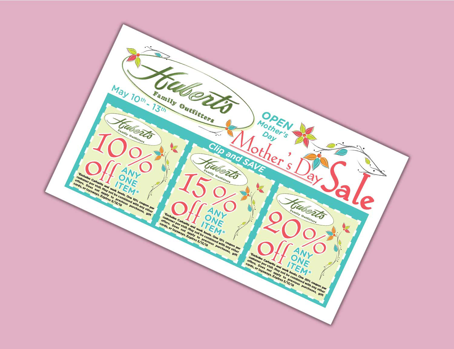
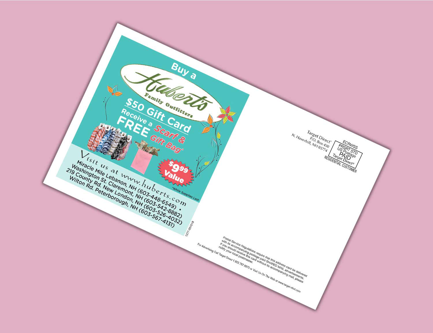
Hubert's
West Lebanon, NH
West Lebanon, NH
This Mother's Day sale postcard was created using a pastel color palette, giving it a seasonally springtime look. Delicate, curvy text accentuates the feminine aesthetic.
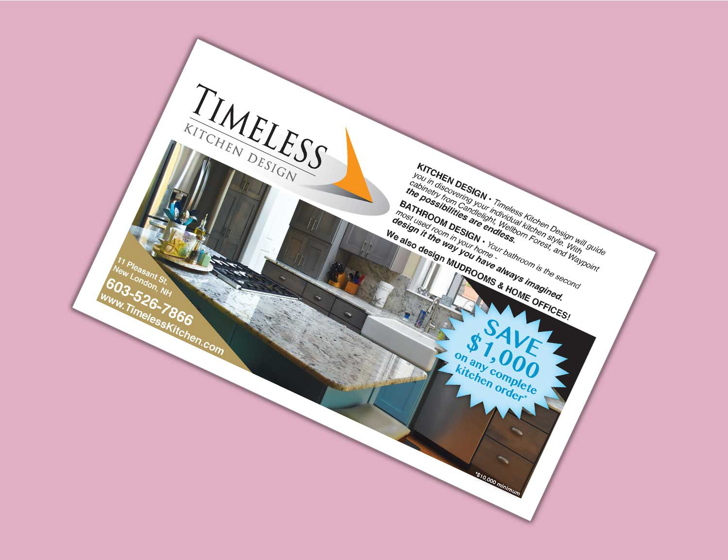
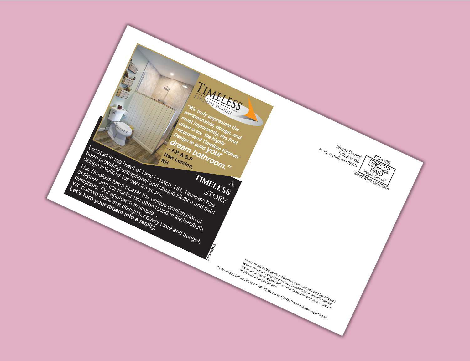
Timeless Kitchen Design - Discount Offer
New London, NH
New London, NH
After receiving the copy for this card, I researched the company website and pulled a customer quote for the back of the card. I echoed the angular design of the Timeless Kitchen Design logo through the use of the color scheme, triangles, and an angled, overlapping design on the back of the card.