The Bayley Hazen road, a historical military road built during the Revolutionary War, inspired an idea for a craft brewing company of the same name.
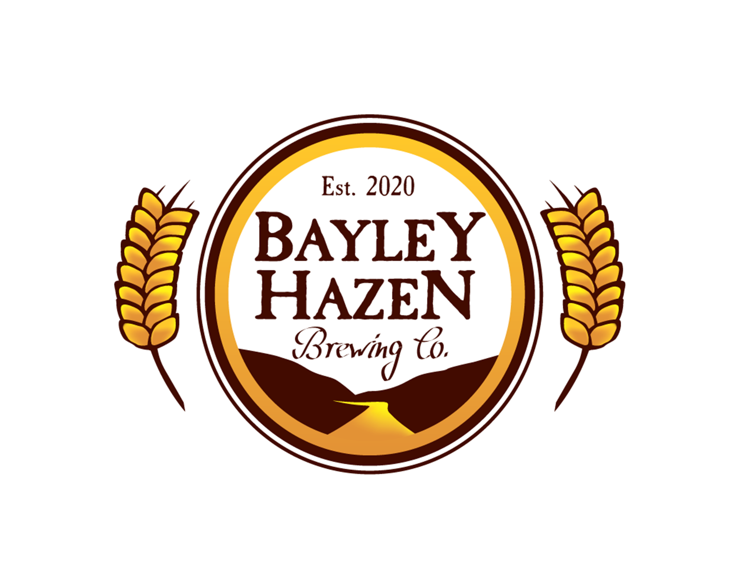
The logo uses Caslon Antique, the most classic of colonial era fonts, to evoke the feeling of the time period. Coupled with an original graphic, this font creates a logo that feels both original and familiar to the viewer. A script is incorporated for “Brewing Co.” , written in a hand that one can imagine might have been scrawled using a quill pen by the light of a flickering candle as the British approach. The surrounding graphic compliments the text. The slant of the mountains draws the eye in, to the road. The flow of the road into the yellow band unifies graphic and text. Two circular bands outside of this add texture, and provide a smooth transition to the wheat graphics.
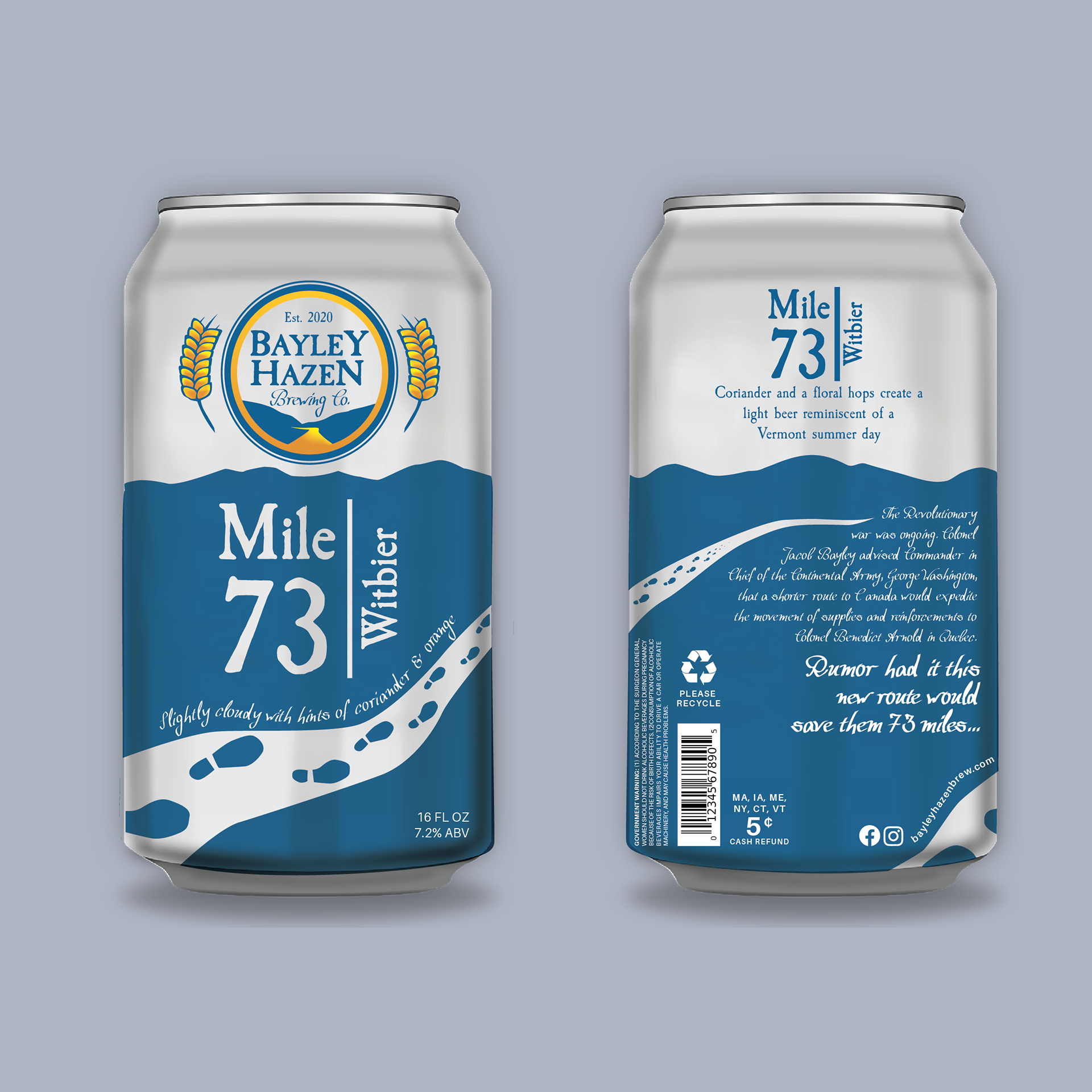
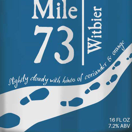
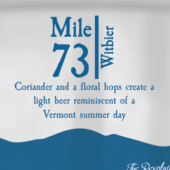
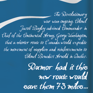
All Bayley Hazen beers are named after historical facts and/or legends, and their flagship beer, Mile 73, is commemorative of the 73 miles that the Bayley Hazen road was going to save the Continental Army in their travels to Quebec during the Revolutionary War. I chose this beer as the flagship beer because it is directly related to the reason that the Bayley Hazen road ever came to be. Footprints are shown on the road, wrapping around the can and guiding the viewer to the story on the back. All fun and interesting copy corresponds with that of the logo. All mandatory copy (Fl. Oz., Please Recycle, etc.) is in a sans-serif font. The art is clean and simple while still maintaining character, and works with the logo to form a cohesive whole as a packaged product.
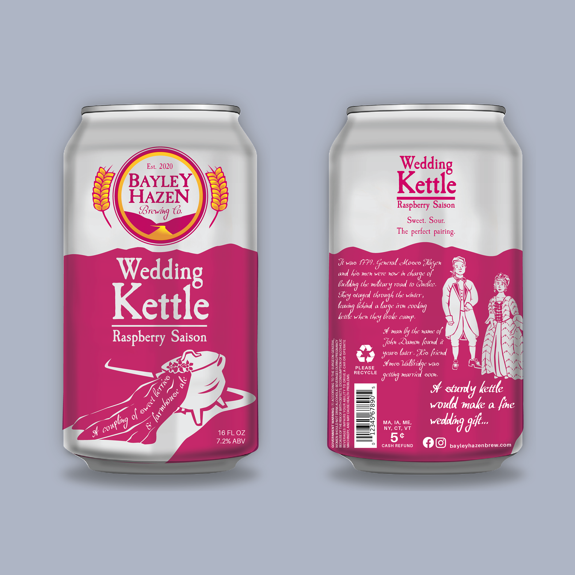
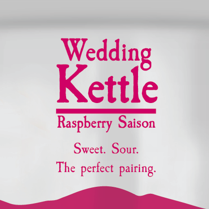
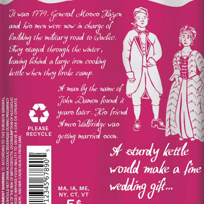
Wedding Kettle Raspberry Saison is the second beer in this project. As the story goes, Moses Hazen and his men left a cooking kettle behind on the Bayley Hazen road after they took over the construction of the road. The kettle was found by a man named John Damon, who later gave the kettle to Ames Walbridge as a wedding gift.
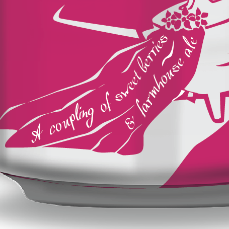
I used a dark fuschia as the color for this product, which builds anticipation for the juicy, fruity saison inside. It was fun to create a wedding themed play on words while writing the drink description copy. The kettle dancing down the road in a wedding veil adds a zany, whimsical element that is fitting for beer packaging.
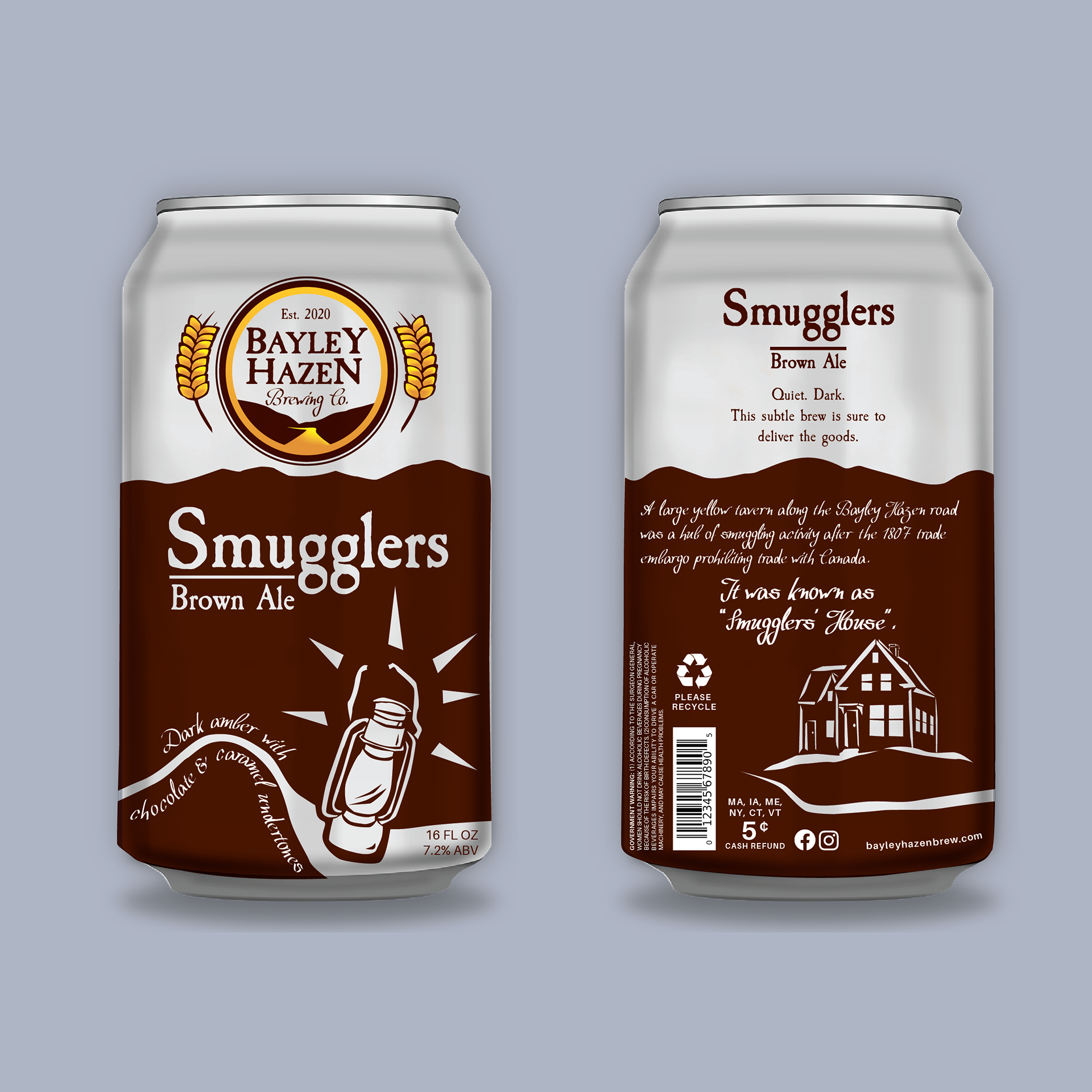
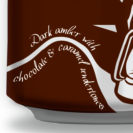
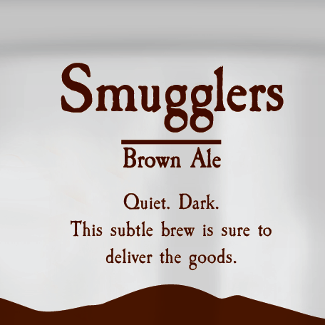
Smugglers Brown Ale. This brew is a dark amber with chocolate and caramel undertones. A good hearty ale, it would be a fitting drink for the winter months.
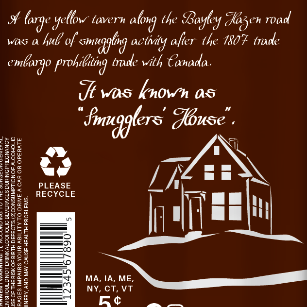
Based on stories of smuggling activity that took place in the 1800s along the Bayley Hazen Road, the packaging for this beverage features a lantern hovering over the road, as might be seen as smugglers traveled through the night on their way to Canada. The lantern balances the text on the left, and the description of the beverage follows the curve of the road, adding a feeling of movement. The road wraps around to the back of the can and past the “Smugglers’ House”, where the windows shine bright. The residents are awake and ready for travelers! Perhaps there is a cask of ale that can be tapped...
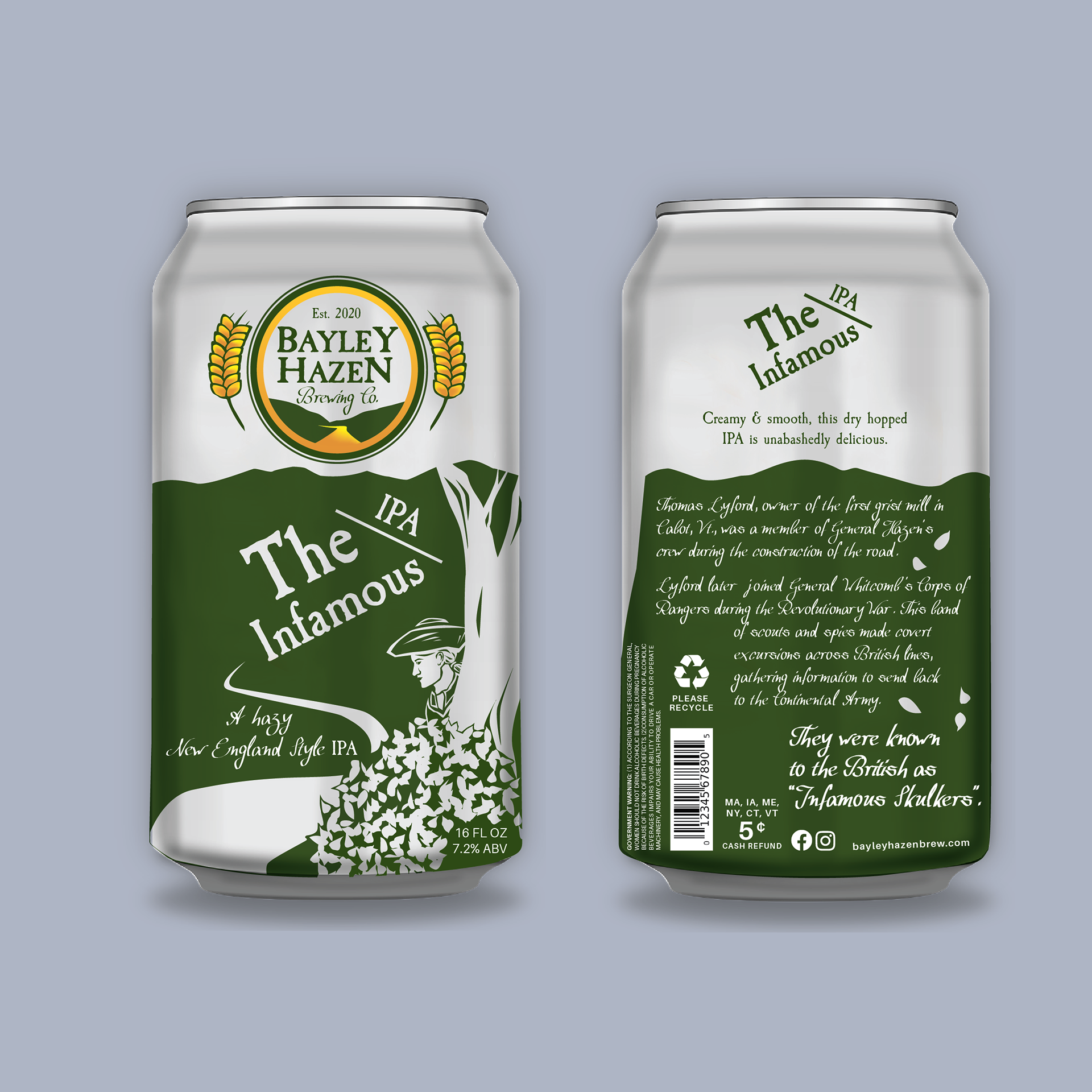
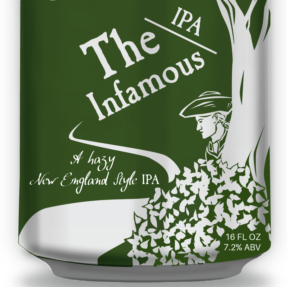
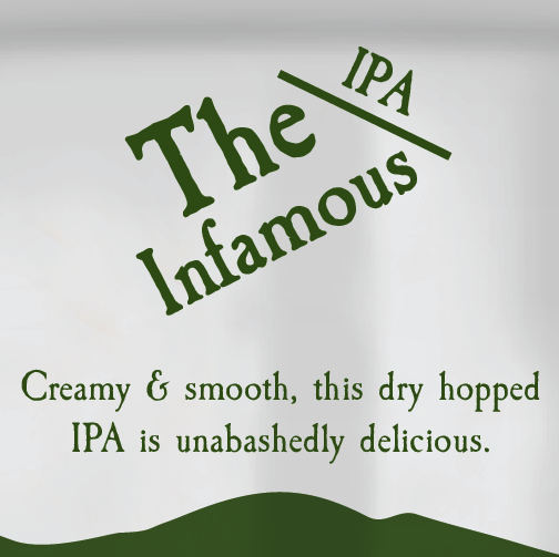
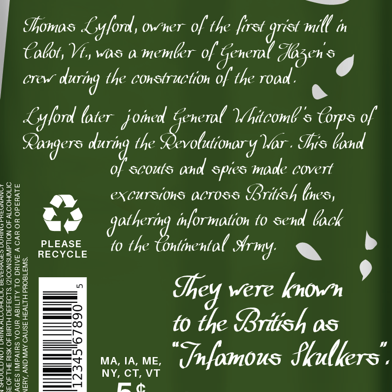
The last Bayley Hazen Brewing Co. beer for this project is The Infamous, a New England Style IPA. Named after the nickname the British had for the group that would become Whitcomb’s Rangers, The Infamous is a New England Style IPA. The Vermont state colors are green and gold, which ties in with this packaging concept. The curve of the road on the front illustration brings the eye through from the title, to description, to the ranger looking out. The slant of the type in the title speaks to the exciting and precarious nature of being a spy during the Revolutionary War.